Hyped Articles Checkout
An invitation-based shopping experience with 15M+ requests across 28 markets.
Zalando · Fashion tech- My role
- Product design — customer research, interaction design, reusable components and accessibility.
- Team
- Transactions, Purchase Risk Management, Customer Platform and Global Catalog.
- Markets
- 28 European markets
- Goals
- Give customers a fairer chance to buy limited releases by separating registration from purchase.
- Results
- The experience received more than 15 million invitation requests across 28 European markets. In the first Invite-Only drop, the suspicious-purchase rate was approximately 60% lower than the comparison group of products using Zalando’s existing protection measures: 3.4% of purchases were flagged as suspicious.
A new way to shop limited releases at Zalando
Limited sneaker releases on Zalando could sell out in five to seven minutes. Customers were competing with resellers using bots, while teams had to prepare the platform for sharp spikes in demand. Buying a sought-after pair often came down to who could get through checkout fastest.
I designed Invite-Only to separate registration from purchase. Customers could request an invitation, then return to buy if selected. The experience received more than 15 million invitation requests across 28 European markets. My work connected product pages, email, the app and checkout so customers understood where they stood at each step.
Why the experience needed to change
Zalando serves customers across European markets, selling fashion from a wide range of brands. Limited sneaker releases brought a different challenge from everyday shopping: large numbers of customers wanted the same product at the same time.
Some releases sold out within five to seven minutes. Resellers used bots to automate purchases, while customers buying manually encountered cart and checkout failures. Customers also did not always understand when a product had already sold out.
Engineering and operations teams had to prepare for each release by increasing system capacity and coordinating the sale. Taking a product offline could interrupt the campaign promoting it. The problem extended from discovering the release to successfully completing the purchase.
My role
I was responsible for customer research, interaction design, reusable components and accessibility. My work covered how customers signed up, moved from the website to the app, and understood whether they could buy. I worked with product managers and engineers; the risk team defined how customers were selected for invitations.
The experience spanned product pages, email, the app and checkout. Across those steps, my focus was to help customers understand what had happened and what they could do next.
My work connected the invitation model to the steps customers took: registering for a product, waiting for a decision and returning to buy. Research, product-page states, email messages and reusable components turned those steps into a consistent experience across the website and app.
Shaping the approach
Looking beyond the moment of purchase
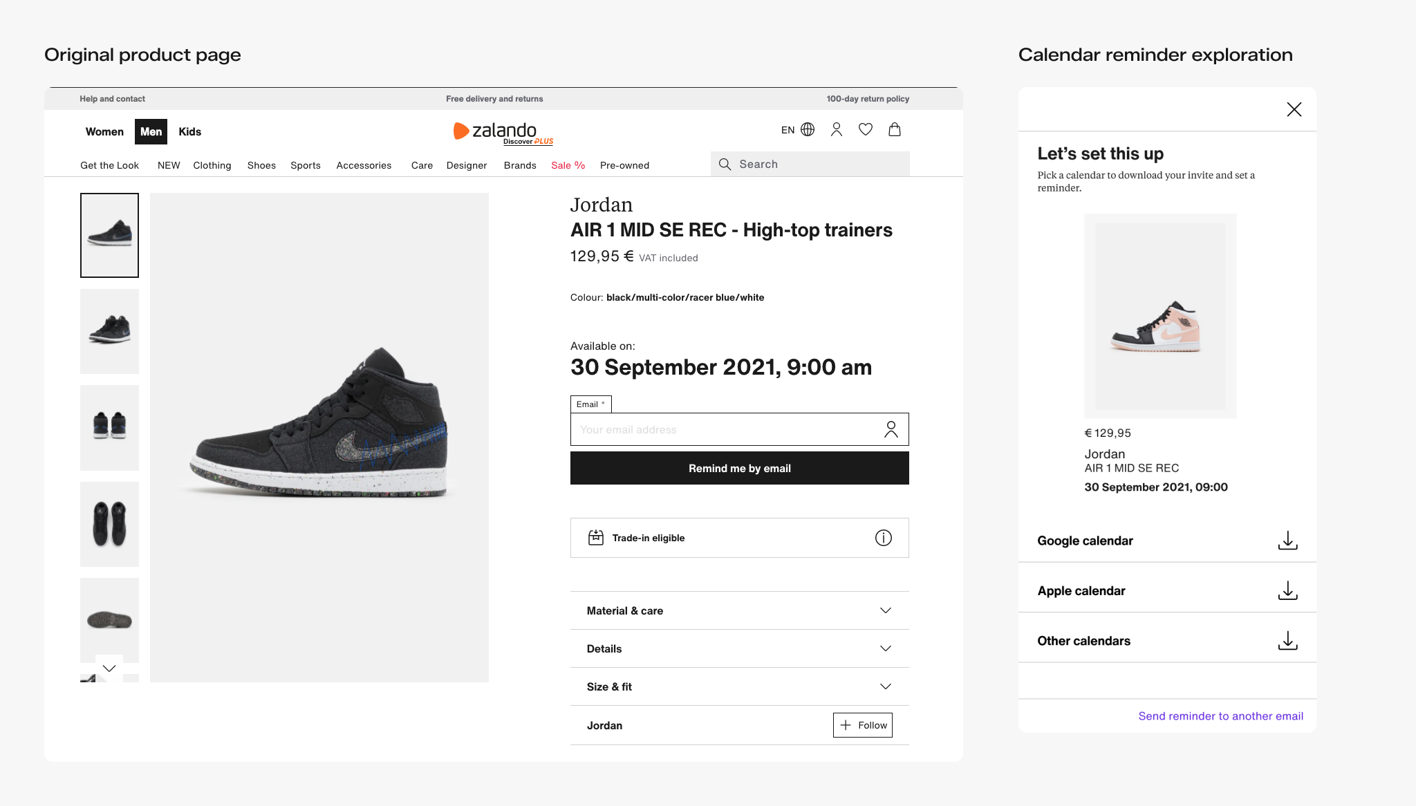
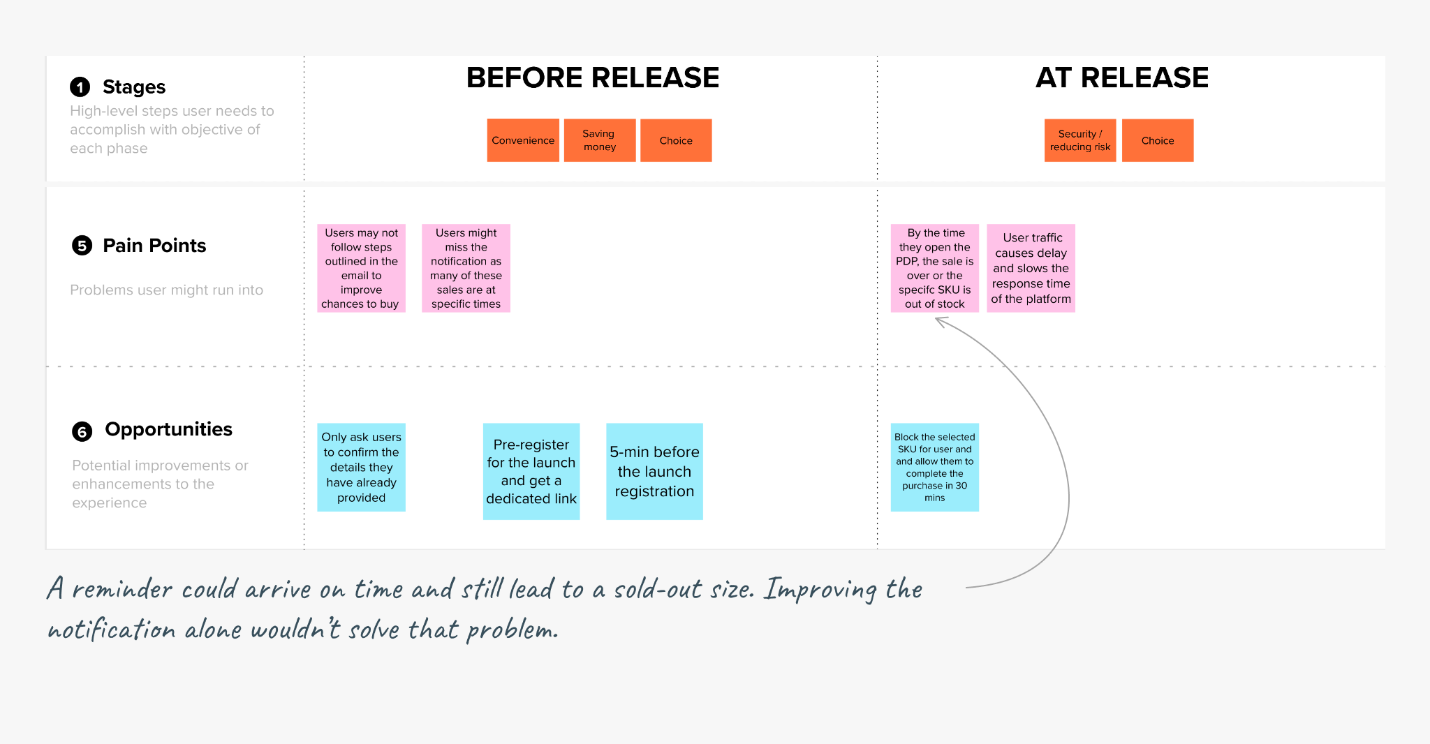
The work included improvements to release reminders and a dedicated checkout, as well as the invitation experience. A dedicated checkout addressed how a purchase was handled. Invitations changed when a customer could make that purchase: registration and buying became separate steps.
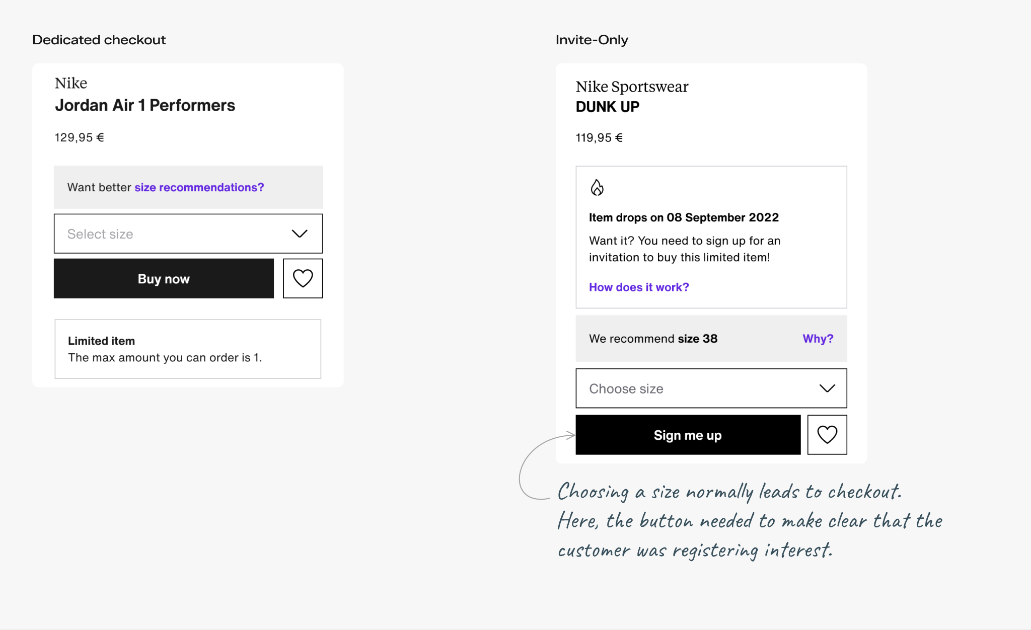
That introduced a new design problem. Choosing a product and size would no longer mean the customer was placing an order. For my design work, the challenge was to explain what registration meant, what happened next, and when a customer could actually purchase.
Learning what customers needed to understand
The M0 research I conducted identified three priorities: helping customers act without worrying they would miss the product, setting clear expectations across communications, and making releases understandable to people new to shopping for sought-after sneakers.
For the invitation experience, those priorities mattered throughout the wait. Customers needed to understand the difference between registering for an invitation and receiving one, and what receiving an invitation allowed them to do.
Keeping the first release focused
Zalando sells products directly and through partner sellers. The product team reviewed 600 products with stock available. Only three were offered by more than one seller.
I worked with the product team to keep seller selection out of the first release. With so few products offering a choice of seller, a separate selection screen added little value. The registration flow asked customers to choose their product and size.
Making the invitation experience understandable
Choosing a product was the start of registration
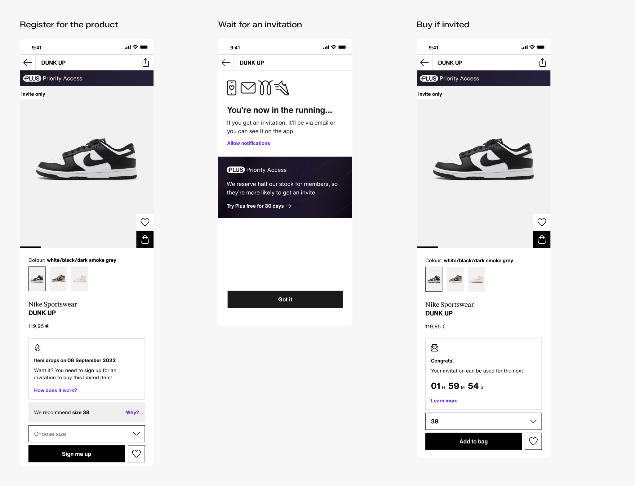
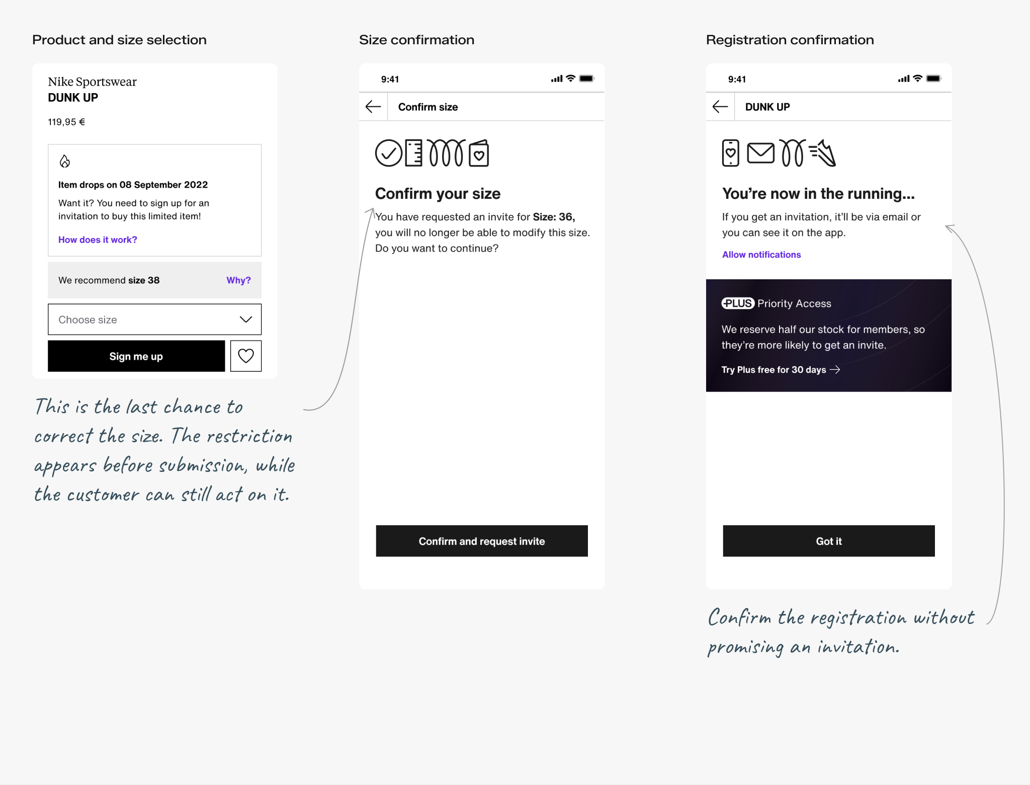
The product page introduced registration beside the size selector and sign-up button. Customers could see that they needed to sign up to buy the item and open an explanation before deciding to continue.
Size selection was a commitment: Before completing registration, customers were asked to confirm their size and told they could not change it afterward. The acknowledgement then explained how an invitation would arrive, without suggesting that the customer had bought or reserved the product.
Showing the right action when the page opened
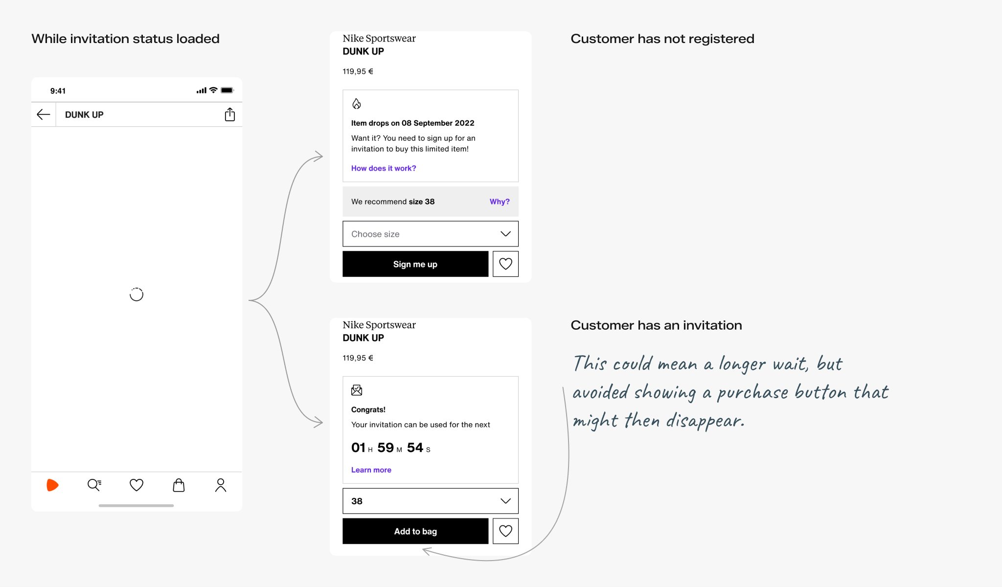
The product page needed to check whether a customer had an invitation before showing “Add to bag.” That check could take longer than loading the product details, creating a risk of showing the purchase button to someone who could not yet buy.
I reviewed three options with the product manager and engineers: show an error, disable the purchase button, or wait for the check to finish. Together, we chose to keep the loading screen visible until both the product details and invitation status were ready. Customers might wait longer, but would not see a purchase button appear and then disappear.
Helping web visitors find the product in the app
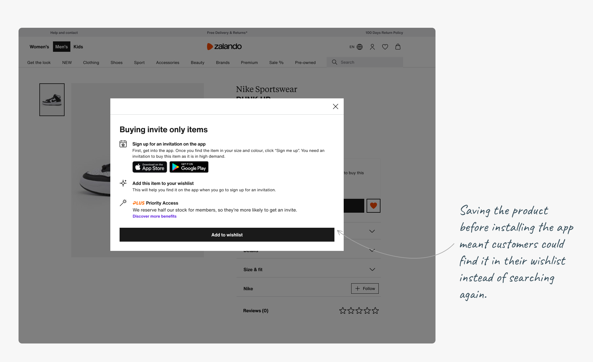
For the first release, customers needed the Zalando app to register for an invitation. They could still discover the products on our website.
I designed the web dialog with an “Add to wishlist” action alongside the app download links. The product manager had proposed saving the item; my task was to make that step understandable in the handoff. The dialog explained that customers could find the saved product in the app and continue registration.
Making membership benefits clear
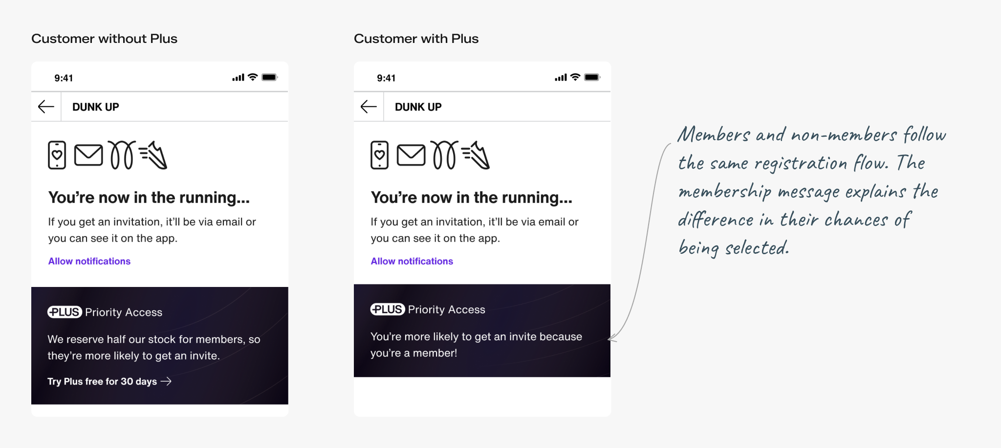
Zalando Plus was Zalando’s membership programme. Members had a greater chance of receiving an invitation, but customers without membership could also register.
I kept the registration steps the same for both groups and tailored the confirmation message to explain the membership benefit. Non-members could see that some stock was reserved for Plus members and that they could still receive an invitation.
Designing what happened after registration
Helping customers use their invitation
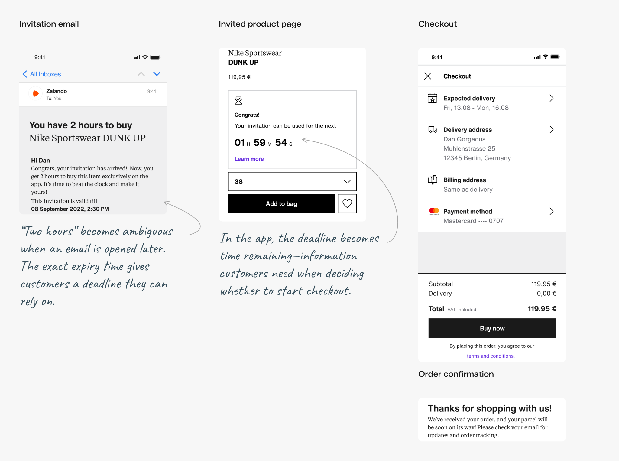
An invitation could arrive after the customer had left the app. Email and app notifications brought them back to the product. On the product page, a countdown showed how much time remained, and the action changed to “Add to bag.”
The accompanying guidance explained that the invitation lasted two hours, could be used only by the account that received it, and allowed the customer to buy one of the invited item. The customer still had to complete checkout before the invitation expired.
Giving customers a next step when they could not buy
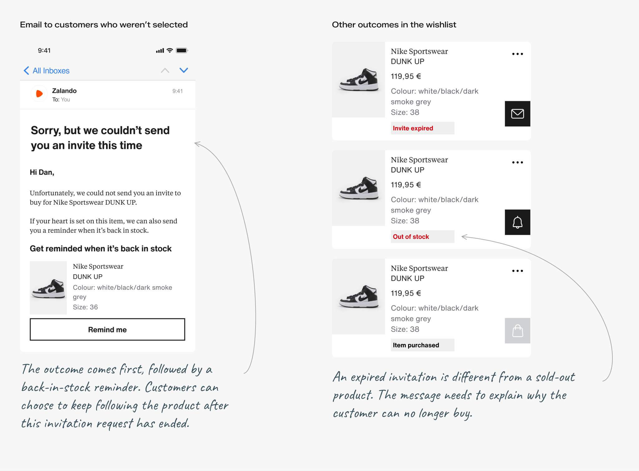
Not everyone who registered would receive an invitation. The not-selected message explained the outcome and offered a back-in-stock reminder. Customers did not have to interpret silence as the outcome of their registration.
Separate messages covered expired invitations, out-of-stock products and items already purchased. These situations needed different explanations: missing the purchase window was different from waiting for more stock.
Making the experience consistent
A shared way to explain each stage
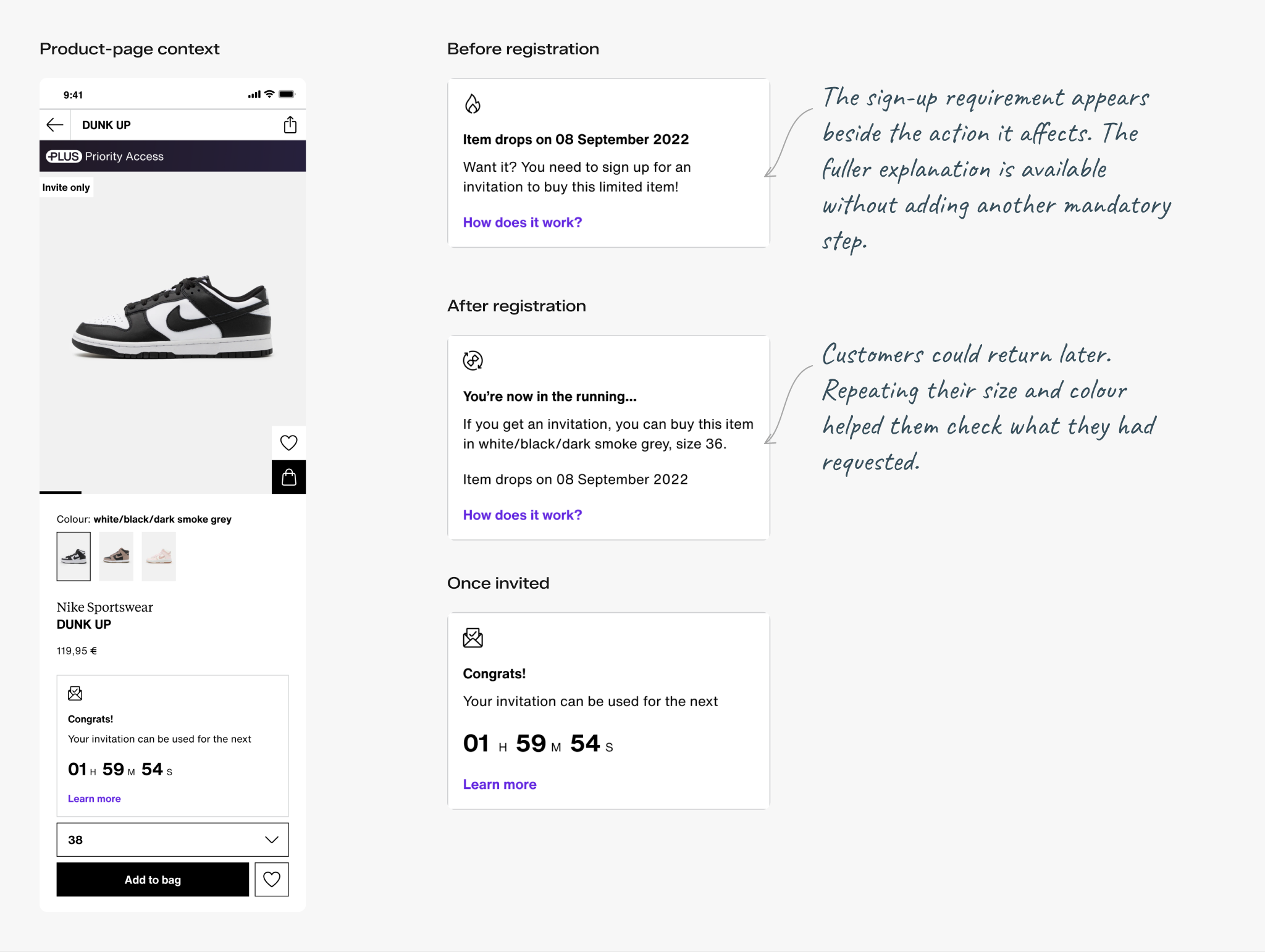
Registration, waiting and purchasing needed different messages, but customers were still looking at the same product. I designed a shared message component so those changes could fit a consistent structure.
The component supported short messages, longer explanations and countdowns, with optional icons and links. My specifications defined the content, spacing and layout for each variant, so the product page could accommodate each stage without a separate pattern.
Designing for accessibility
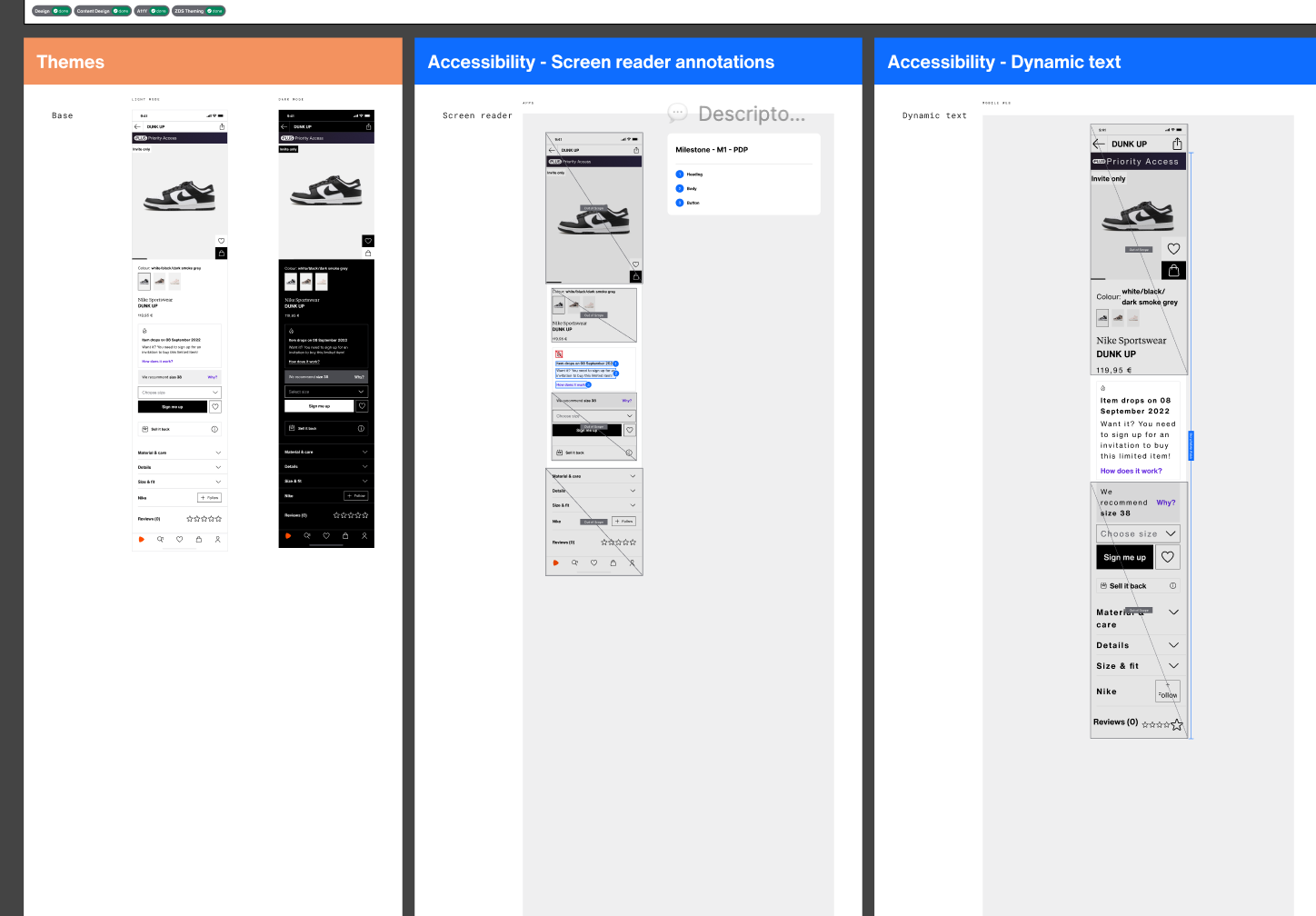
I designed light and dark themes, adapted the invitation content for larger text, and annotated the reading order and element roles for screen readers. I documented these alongside the product screens so engineering could see how each requirement applied to the same experience.