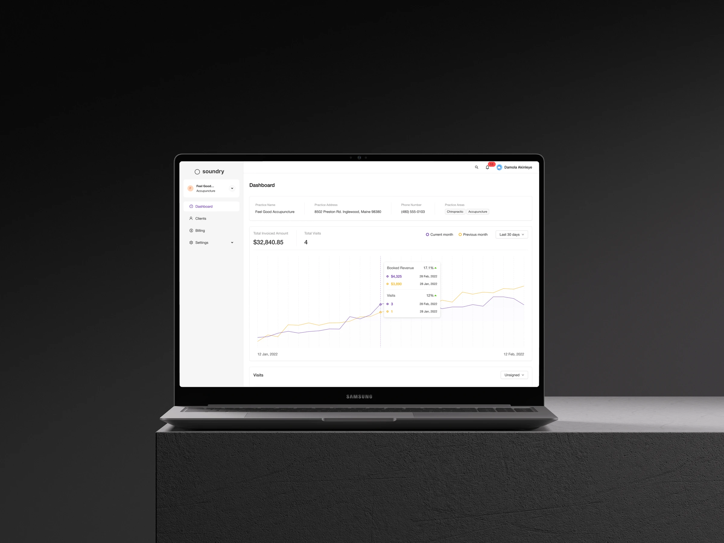
Soundry EHR Portal
Redesigning an EHR for small US practices so that every appointment produces an insurance claim that gets paid.
SOUNDRY HEALTH- Timeline
- 6 months
- Team
- Oyindamola Akinleye Founding Product Designer
- Austin Howe Founding Software Engineer
- Barry Saik CEO
- Market
- US integrative-health practices
- Website
- Visit Soundry
Project summary
Soundry is an electronic health record (EHR) for small acupuncture and wellness practices in the US, covering scheduling, clinical documentation and billing. These practices depend on insurance reimbursement, and insurers pay only when a claim is complete and accurate. When I joined, Soundry stored practitioners’ notes but could not produce the insurance claims practices needed to get paid.
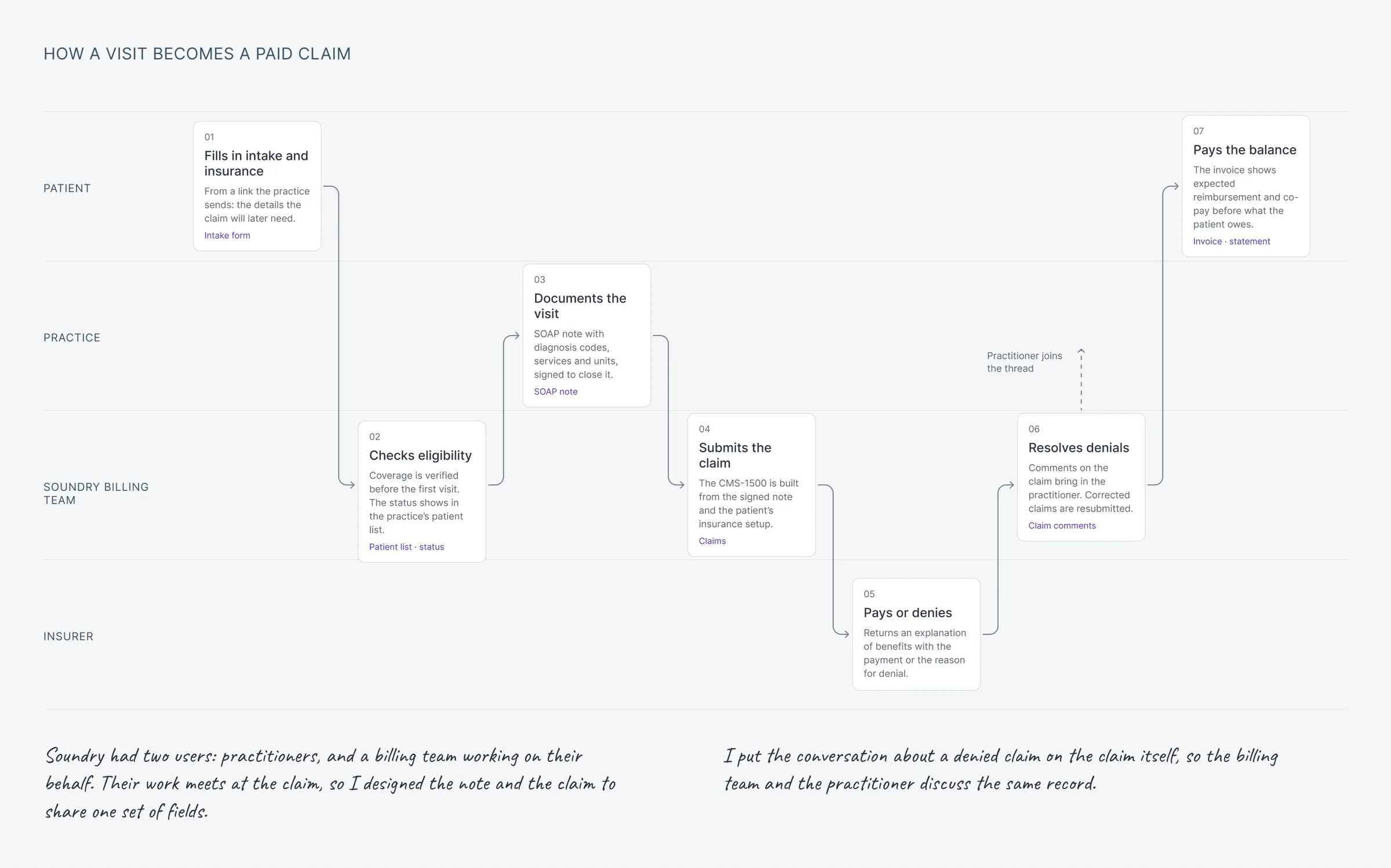
As founding product designer, I led the redesign around a single goal: every documented appointment should become a claim the insurer pays on first submission. Over six months, working with the CEO, one engineer and Soundry’s in-house biller, I designed three connected applications: a practice app, a workspace for Soundry’s billing team and a patient app. The product launched and grew to more than 90 US providers, processing over $2M in insurance coverage.
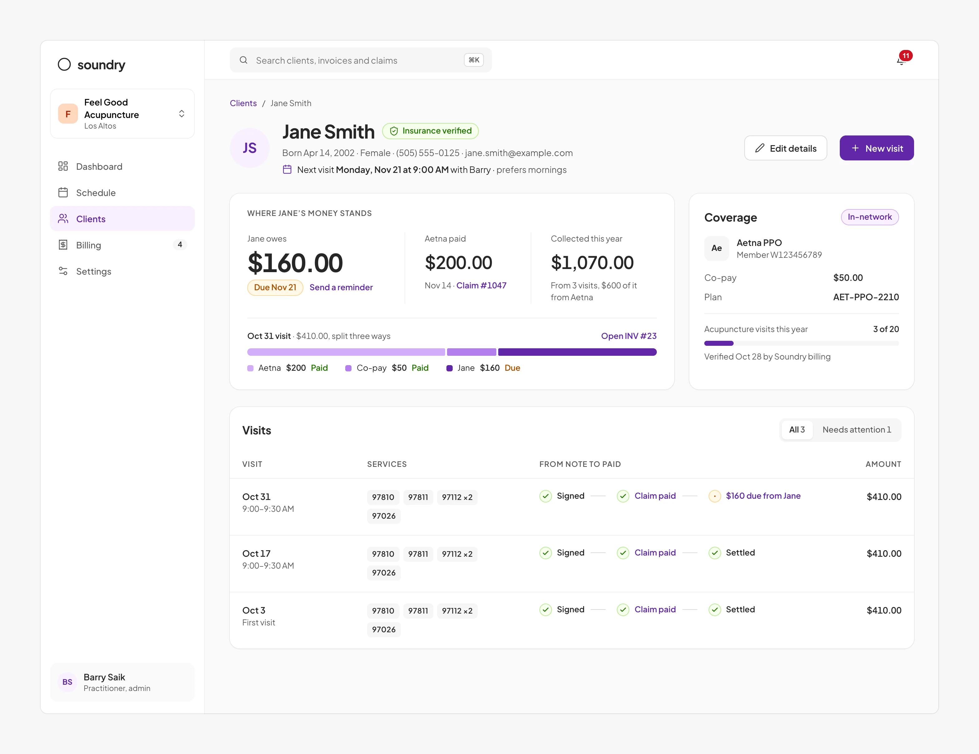
- Diagnosis in the assessment The note had no diagnosis, so no claim could be filed. The diagnosis is chosen inside the assessment, where the practitioner makes it.
- Units on every service Each service had a fee but no units. Units sit beside the fee, and each line’s amount follows from them.
- Services name their diagnosis Insurers pay only when a service names the diagnosis it treated. Each service line points to the diagnosis it addressed.
- Signing completes the claim Nothing in the signed note could go on a claim. Once signed, the note gives the claim everything it needs from the appointment.
The problem: appointments did not produce claims
To be reimbursed, a practice submits a claim to the patient’s insurer: a standardised form (the CMS-1500) with 33 fields covering the patient, their coverage, the diagnosis and each service provided. If any field is missing or incorrect, the insurer rejects the claim. These rejections, known as denials, typically arrive weeks after the appointment.
After each appointment, the practitioner records a visit note describing the patient’s symptoms, the findings and the treatment given. In the version of Soundry I joined, the note consisted of four free-text fields, with no structured place for diagnosis codes, service codes or quantities. Soundry’s biller therefore reconstructed each claim manually from notes and messages, and errors returned weeks later as denials. For customers who relied on Soundry to get paid, the product was not delivering its core value.
Research
A claim involves two roles: the practitioner, who holds the clinical information, and the biller, who turns it into a claim. I studied both. I held weekly working sessions with Soundry’s biller, observing them prepare real claims. With the CEO, I interviewed practitioners about how they document appointments and manage billing, and we surveyed around 40 practices to validate the patterns at scale. I later ran usability tests of visit-note prototypes with practitioners.
Key findings
Most billing time was spent retrieving missing information
In the biller sessions, most of the time went to requesting missing diagnoses, unit counts and insurance details from practitioners. With complete information, a claim took minutes. The opportunity lay in capturing information at the source, not in accelerating claim entry.
Practitioners hold the clinical information but deprioritise billing
Practitioners described billing as the part of their work they deprioritise, yet they are the only people who know the diagnosis and the treatment provided. A workflow framed as billing would be skipped; one framed as clinical documentation could succeed.
The cost of a denial lay in the delay
Denials arrived weeks after the appointment. Resolving one meant identifying the appointment, the treating practitioner and the error, typically over email and phone. Most of the effort went into recovering context.
Practices measure the product by revenue
In interviews and the survey, practitioners’ first priority was what patients and insurers still owed them. Clinical detail came second.
These findings shaped four design principles, against which every screen was reviewed: capture each piece of information once, from the person who knows it; frame questions in clinical language; keep every claim linked to its appointment and to the person responsible for the next step; and present financial information first.
Strategy: designing from the claim backwards
Rather than begin with screens, I began with the claim form. With the engineer, I mapped each of its 33 fields to the person who first knows the answer, and the point at which they know it: the patient before their first appointment, the practice during setup and the practitioner during the appointment. This mapping became our shared specification.
- The claim form Every insurer is billed on this form: 33 numbered fields on one page. One wrong field gets the claim denied, so each field should come from whoever knows the answer.
- From the patient, before the first visit The patient’s insurance form fills 12 fields: identity, insurer and member number. The patient knows these best, and they’re checked before the visit, not after a denial.
- From the practice’s setup The practice’s settings fill 8 more on every claim: tax ID, address, signature and provider number. They never change between visits, so they’re entered once.
- From the visit note The signed note adds the diagnosis and one line per service. The practitioner records these to sign the note, so the claim reuses them.
- What’s left for the biller 27 fields are complete before the biller opens the claim. The biller checks and sends. Field 22 is used only when a denied claim is resubmitted.
The mapping also defined the product architecture: three applications, one for each group, sharing the same patient and appointment records.
- Three apps The practice, Soundry’s billing team and the patient each have a dedicated app, built on the same records.
- 17 areas, five stages The full product, from practice setup to payment.
- One appointment, end to end The red line traces a single appointment across the three apps, from booking to a zero balance.
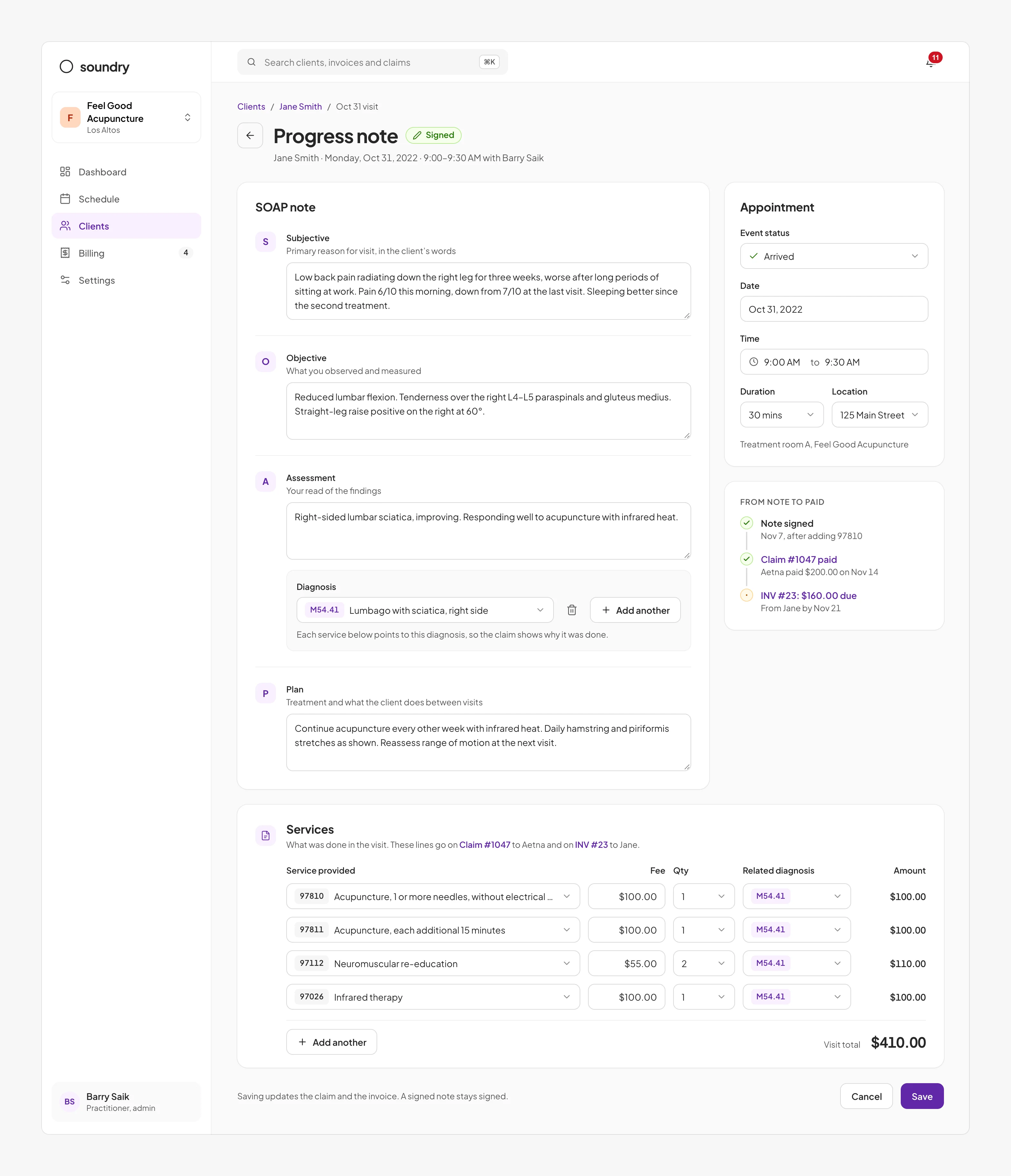
The patient record applies the same principles. In interviews, practitioners opened a record to answer two questions: what is owed, and what requires action. The record therefore leads with the outstanding balance and insurer payments, followed by each appointment with the status of its note, claim and payment.
Decision 1: Capture the claim in the visit note
The visit note is the only point at which the diagnosis and services are known with certainty, by the person who provided them. Rather than have the biller reconstruct this information later, I designed the note to capture it.
I integrated the claim fields into the note, each placed directly after the clinical question that informs it. The diagnosis sits within the assessment, where the practitioner determines it. A services section follows the treatment plan, listing each billable service (for example, 15 minutes of acupuncture) with its code, fee, quantity and associated diagnosis. Practitioners complete these fields as part of documentation rather than as a separate task, and signing the note completes the claim.
Alternative considered: a separate billing tab
My initial design placed billing on a separate tab. Engineering favoured it: it left the clinical note unchanged, was faster to build and appeared to respect practitioners’ aversion to billing. I had doubts, and proposed a prototype test rather than a debate. In testing, practitioners completed and signed the note without opening the tab; any separate step was perceived as billing, and billing was deprioritised. The result settled the decision and established a principle for the rest of the product: integrate new tasks into existing workflows.
- The original note Four free-text fields and a single service selector, with no claim data.
- A separate billing tab My initial design. In testing, practitioners signed the note without opening the tab.
- Billing inside the note The shipped design: claim fields placed directly after the clinical answers they depend on.
Calculated amounts by billing type
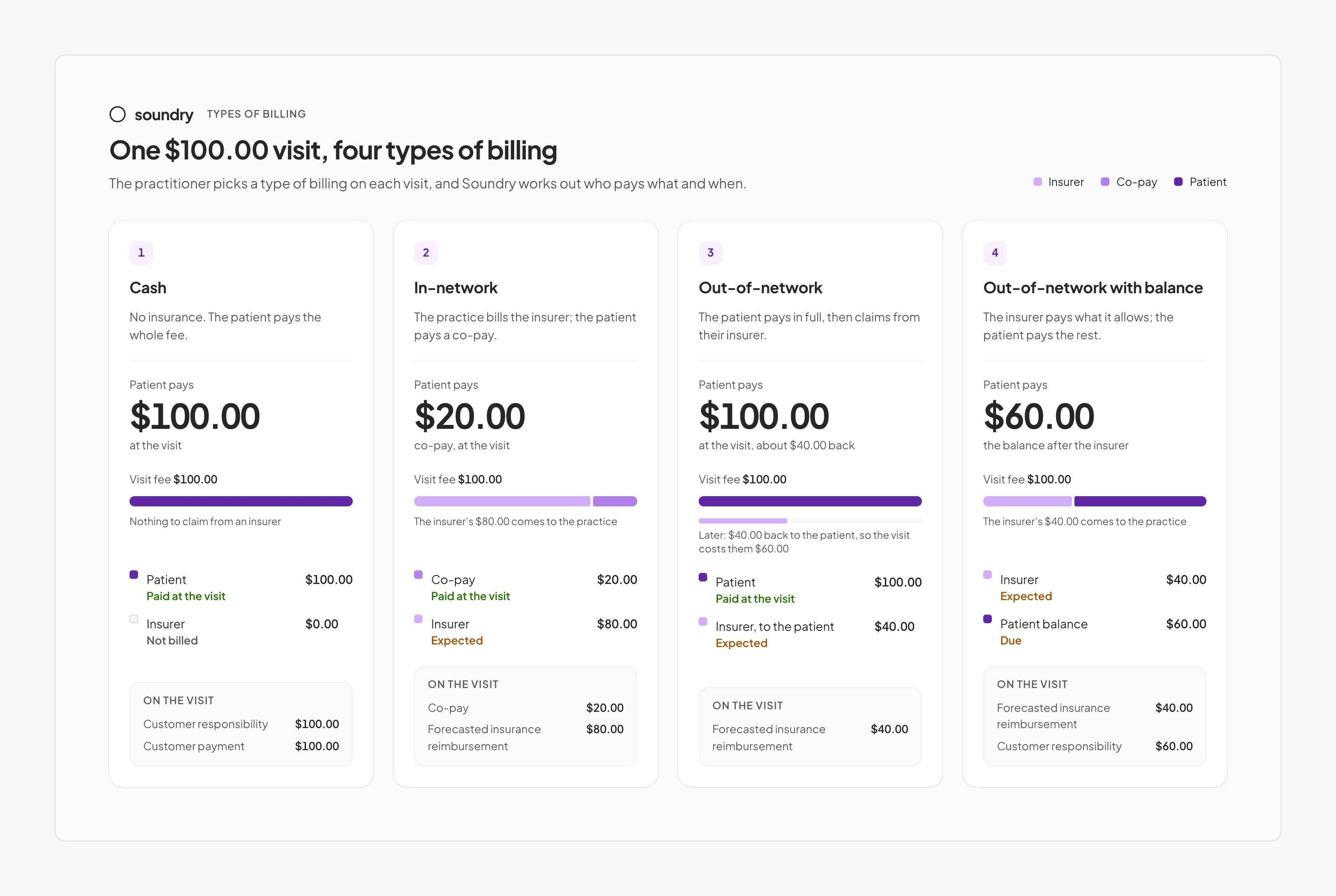
The billing tab surfaced one requirement worth retaining. What a patient pays depends on how the appointment is billed: cash; in-network, where the patient pays a fixed co-pay and the insurer covers the rest; or out-of-network, where the patient may pay upfront and seek reimbursement. Interviews showed that front-desk staff were often unsure of these amounts, leading to overcharges and follow-up requests. I reduced this to a single billing-type selection on the appointment, from which the product calculates each party’s share.
Handling appointments without services
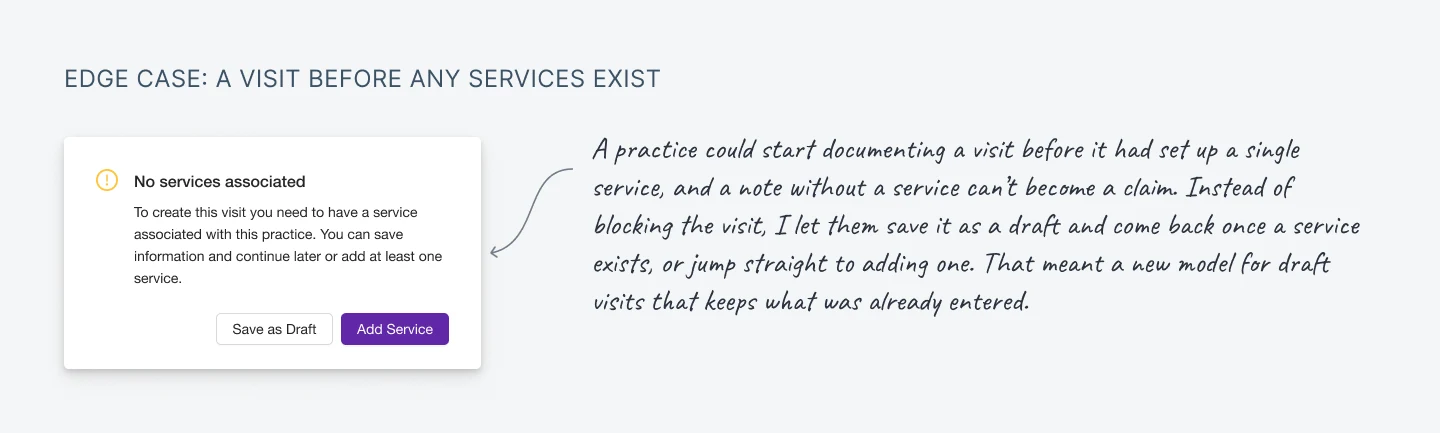
Structured notes introduced a new failure state: a new practice could begin an appointment before configuring its services, and a note without services cannot become a claim. Blocking the practitioner would violate the principle that billing must never interrupt care. Instead, the note saves as a draft and offers to add the service in place; no work is lost, and the claim completes once the service exists.
Decision 2: Verify insurance before the first appointment
The biller sessions showed that many denials originated from unverified insurance details: an incorrect member number, an expired plan, or a plan that excluded acupuncture. These errors surfaced only when the claim was denied, weeks after treatment.
I moved verification before the first appointment and changed the source of the information. The practice sends new patients a link to enter their insurance details and upload both sides of their card. Patients are the most reliable source of their own details, and the card image allows the biller to verify each field. Soundry’s billing team confirms coverage with the insurer, and the result, including the co-pay to collect, appears in the practice’s client list before the appointment.
- Verification enabled The practice enables insurance verification and receives a link for new patients, making verification part of intake rather than a manual step.
- The patient completes the form The patient enters their insurance details and uploads both sides of the card, giving the biller a source to verify against.
- A task for the billing team Each submission creates a verification request for Soundry’s billing team, who contact the insurer when coverage is unclear.
- Verified in the client list The result appears in the client list the practice already uses, before the patient arrives.
- Coverage on the record The patient record shows the plan, the co-pay to collect and the remaining covered visits, avoiding surprises at checkout.
Alternative considered: automatic verification
Automatic verification at booking was the obvious alternative. For acupuncture, however, insurers’ electronic eligibility responses frequently return “benefit unknown”. The billing team would still need to call, and practices would see a result that appeared definitive but was not. I prioritised a verified answer over a fast but unreliable one.
- Manual entry The original form: front-desk staff transcribed insurance details from whatever the patient provided.
- Automatic verification The alternative: verify at booking. For acupuncture, insurers frequently respond “unknown”.
- Patient-submitted details The shipped design: the patient submits their details and card, and the billing team verifies them.
Decision 3: A billing workspace organised by status
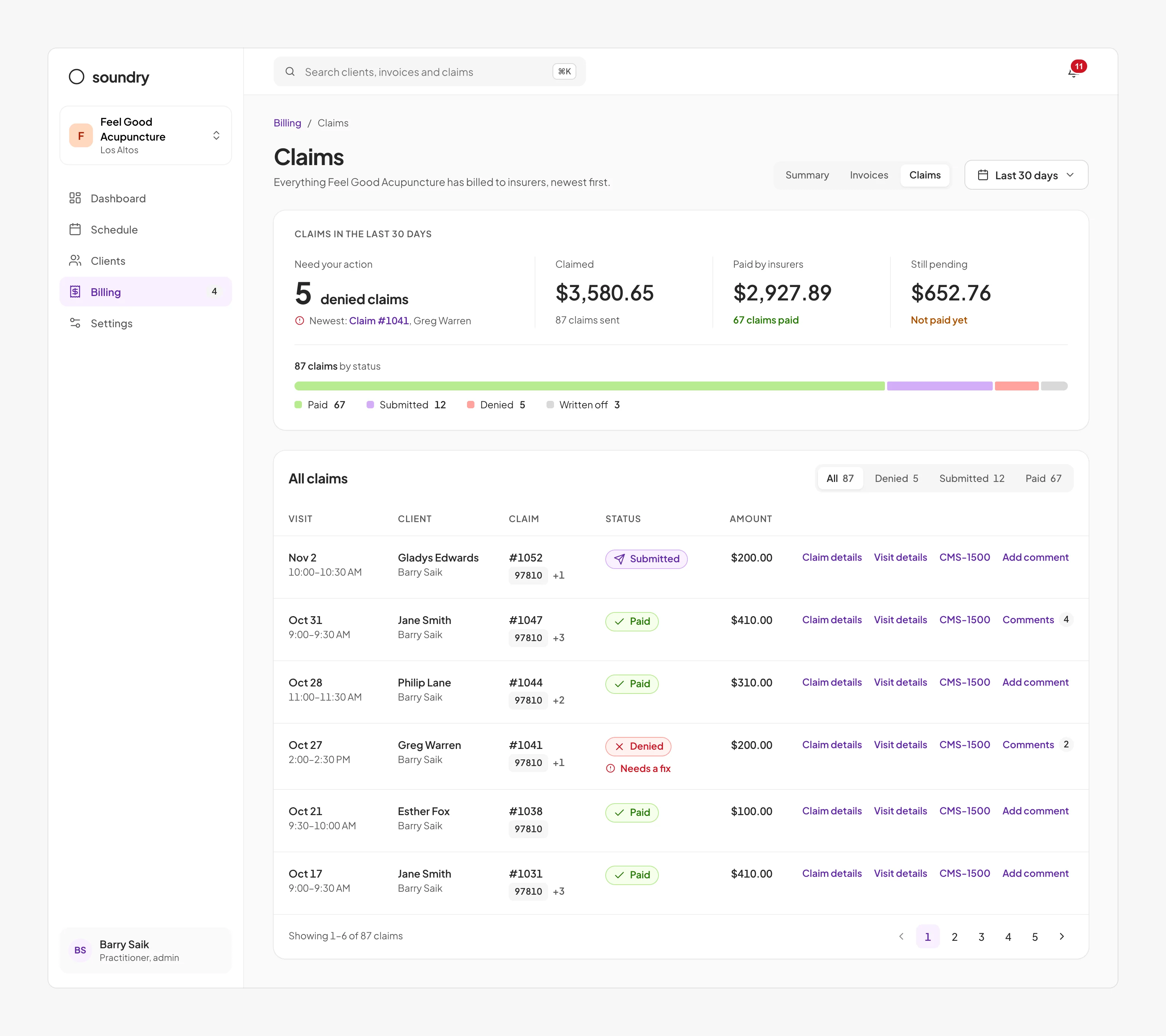
Soundry’s billing team prepared and managed every claim, yet the original product offered them no dedicated tools. Observing the biller showed that their work was organised not by patient but by next action: claims to submit, claims awaiting payment and denials to resolve.
I structured the workspace by claim status (submitted, paid, denied or written off), with denials prioritised as the most urgent and most costly to leave unresolved. Each claim links to its originating appointment and to the claim form as submitted to the insurer, eliminating the most time-consuming step in resolving a denial: recovering context.
Resolving denials on the claim
Resolving a denial requires two people: the biller, who knows why it was denied, and the practitioner, who knows what happened in the appointment. In the biller sessions, this exchange took place over email and phone and frequently stalled. I gave each claim a comment thread: the biller explains the denial and mentions the practitioner, who is notified, corrects the note and responds in the same thread. Email would have been faster to build, but it would have separated the conversation from the claim and left no audit trail.
- The first claim view An early design showing the patient and amount, but not the claim’s status or the reason for a denial.
- Denials by email The alternative: faster to build, but denials arrive in a shared inbox, disconnected from the claim.
- A thread on the claim The shipped design: the reason, the correction and the people involved, recorded on the claim.
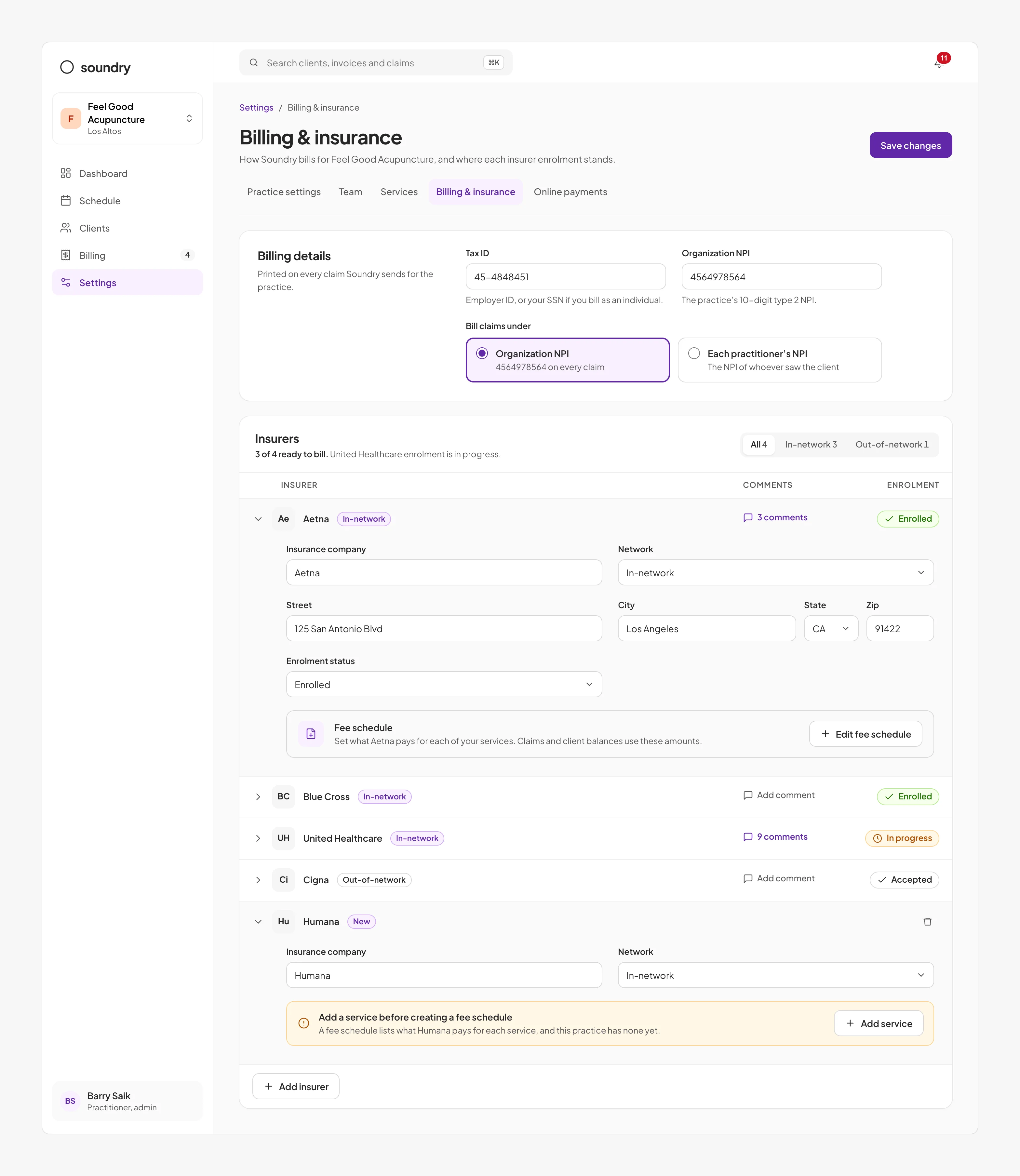
The pattern proved reusable. Before billing an insurer, a practice must complete enrolment, a process of several weeks involving the practice, the billing team and the insurer. Each insurer now carries the same status and comment thread, giving all parties visibility of progress and blockers.
Decision 4: Bill patients on the day of the appointment
Insurers pay weeks after an appointment, and only then is the patient’s share final. Waiting for the insurer before billing the patient was the simplest option, but interviews indicated that delayed bills were more likely to be disputed or ignored, and they extended the time practices waited for payment.
I chose to estimate the split at the time of the appointment. The invoice shows the insurer’s expected payment, the co-pay collected and the patient’s remaining balance, with an explanation of the estimate. When the insurer pays, the payment is applied to the same invoice and the balance updates. Patients receive a clear bill while the appointment is recent, and practices collect their share without waiting on insurers.
- Services become invoice lines Each service on the signed note becomes an invoice line. Nobody retypes a service, so the bill always matches the claim.
- Expected insurance payment The invoice shows what the insurer should pay and what the patient owes. Insurers pay weeks later, so the patient sees their share up front.
- Payments applied The co-pay and the insurer’s payment land on the same invoice. One invoice per visit, so the balance is always what’s really left.
- Patient payment The patient reviews the balance and pays from their phone. Their card is already saved, so paying takes one tap.
- Balance due: $0.00 $50 + $200 + $160: the full $410 is accounted for. Every dollar traces to a payment, so the visit closes with nothing to chase.
- A single amount due The first invoice design showed one total, with no split between insurer and patient.
- Billing after insurance payment The alternative: wait for the insurer. Simpler to build, but patients are billed weeks later.
- The split, up front The shipped design: the insurer’s expected share and the patient’s, from the day of the appointment.
Patient app
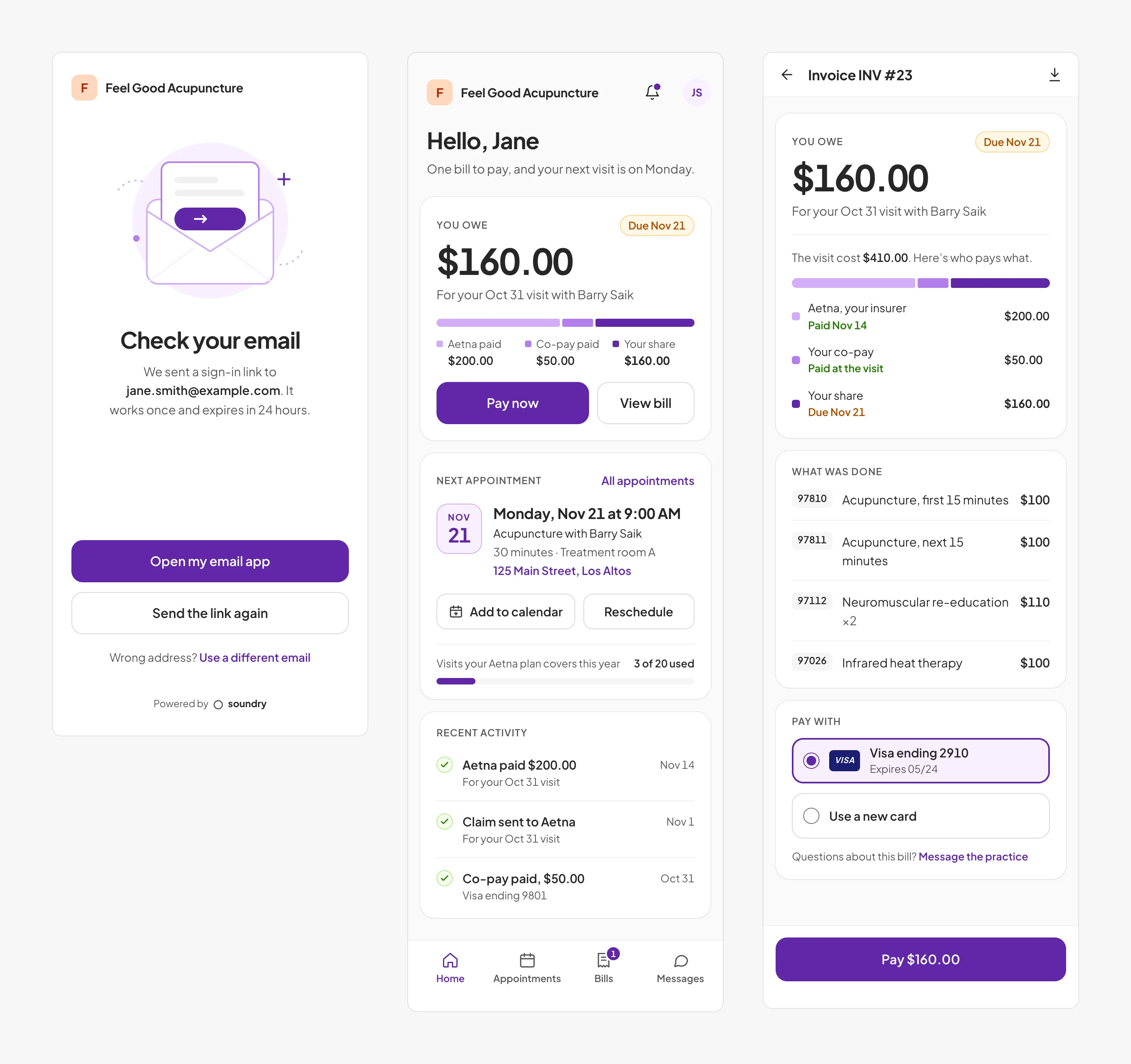
Collection also depends on patients engaging with their bill. Because patients recognise their practice rather than Soundry, the patient app is branded with the practice’s name, with Soundry credited only as “Powered by”. Because patients may visit only a few times a year, sign-in uses a one-time link sent to the email address on file, removing the need for a password. The home screen leads with the outstanding balance and a payment action.
Activation: getting a new practice to its first paid claim
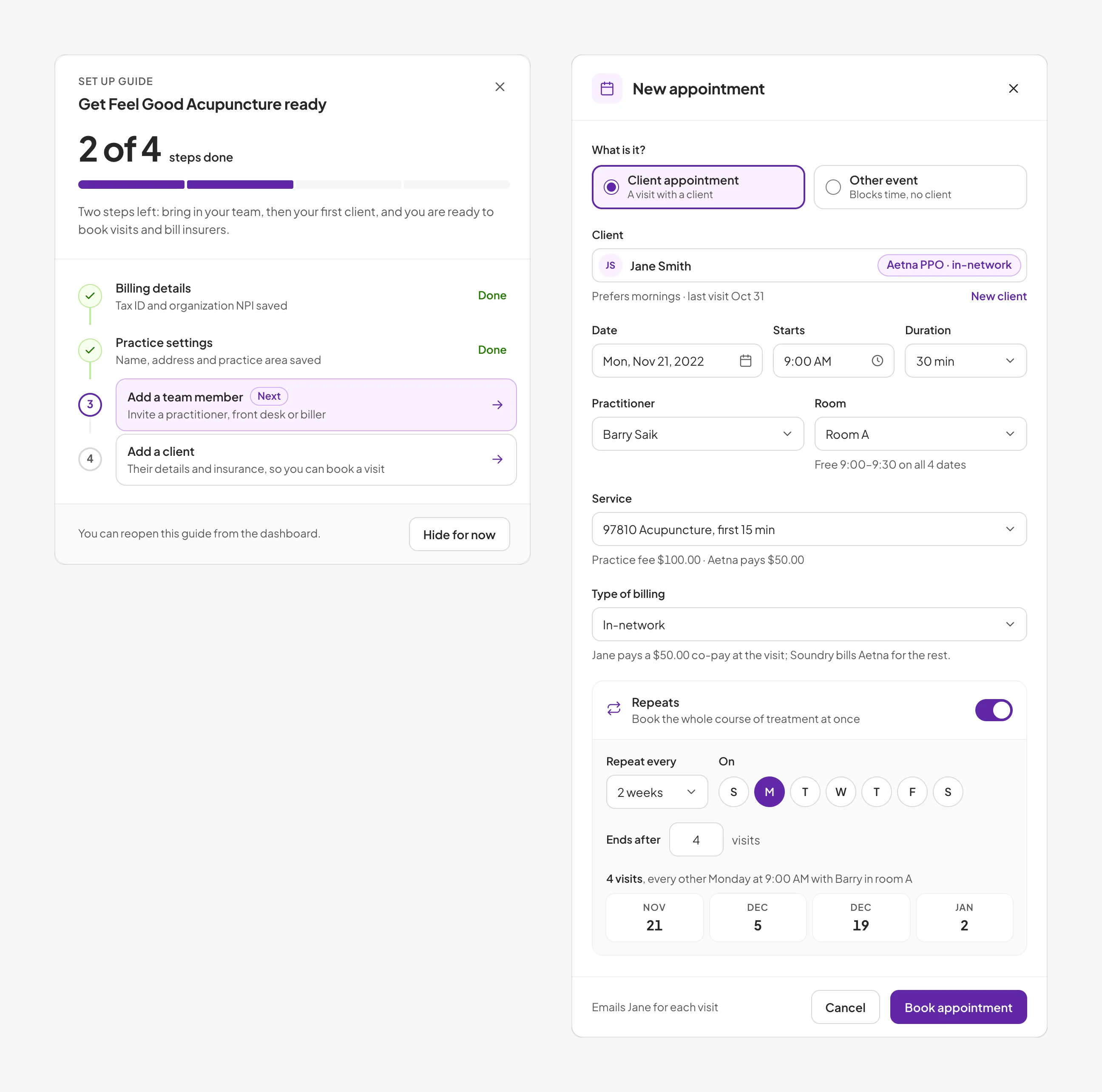
Soundry was sold as a monthly subscription with a 30-day trial. A practice that did not submit a claim during the trial never experienced the product’s core value, so I defined the first claim as the activation milestone. I identified the minimum setup required to bill (billing details, practice settings, one team member and one client) and turned it into a setup guide that remains on the dashboard until complete. All other configuration is deferred. Sign-up requires only the practice and user details, with no payment card, so a trial can begin in about a minute.
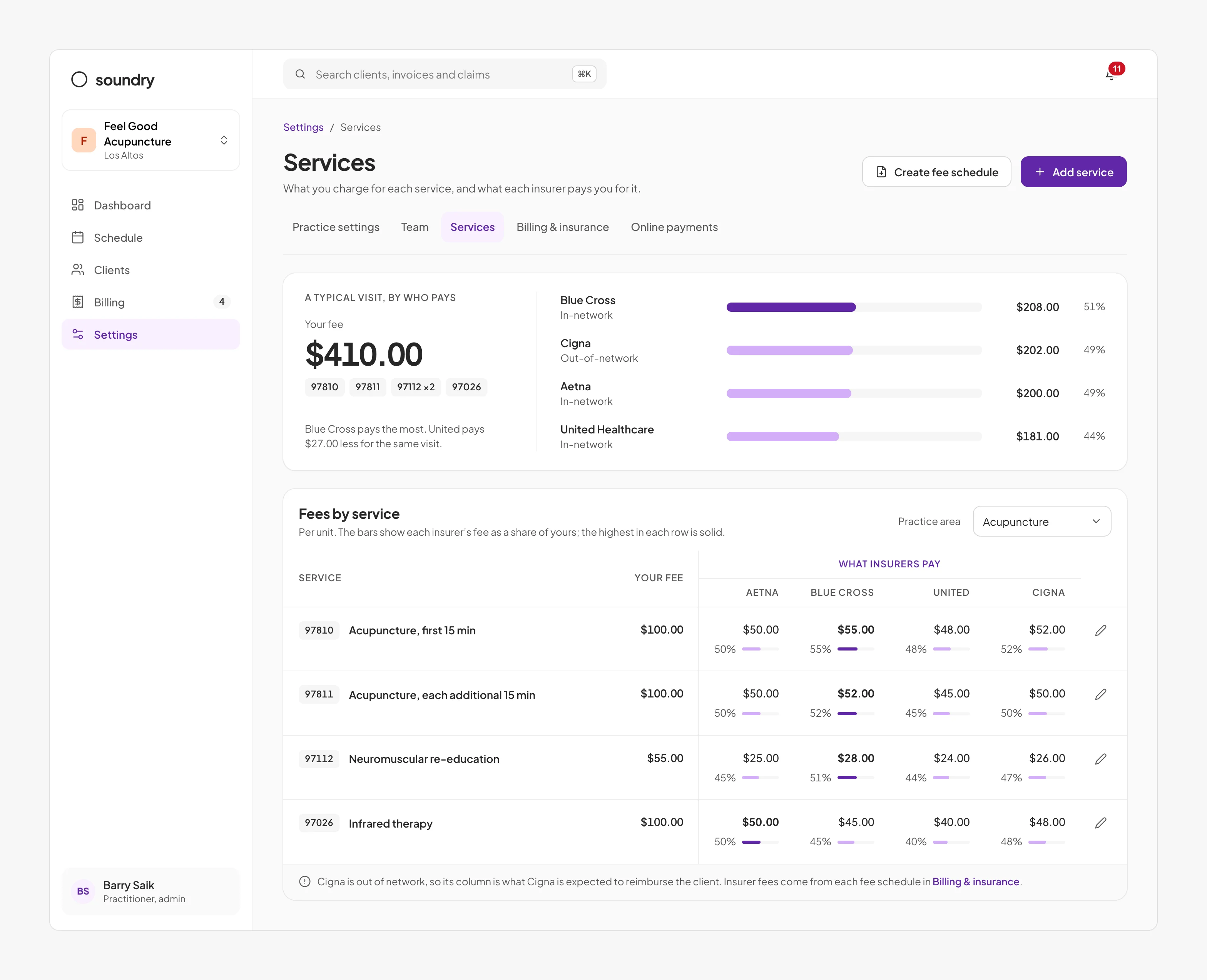
Setup also underpins claim accuracy. Insurers reimburse different amounts for the same service, and the patient’s estimate depends on the correct one, so each service stores the practice’s fee alongside each insurer’s rate.
Plan design
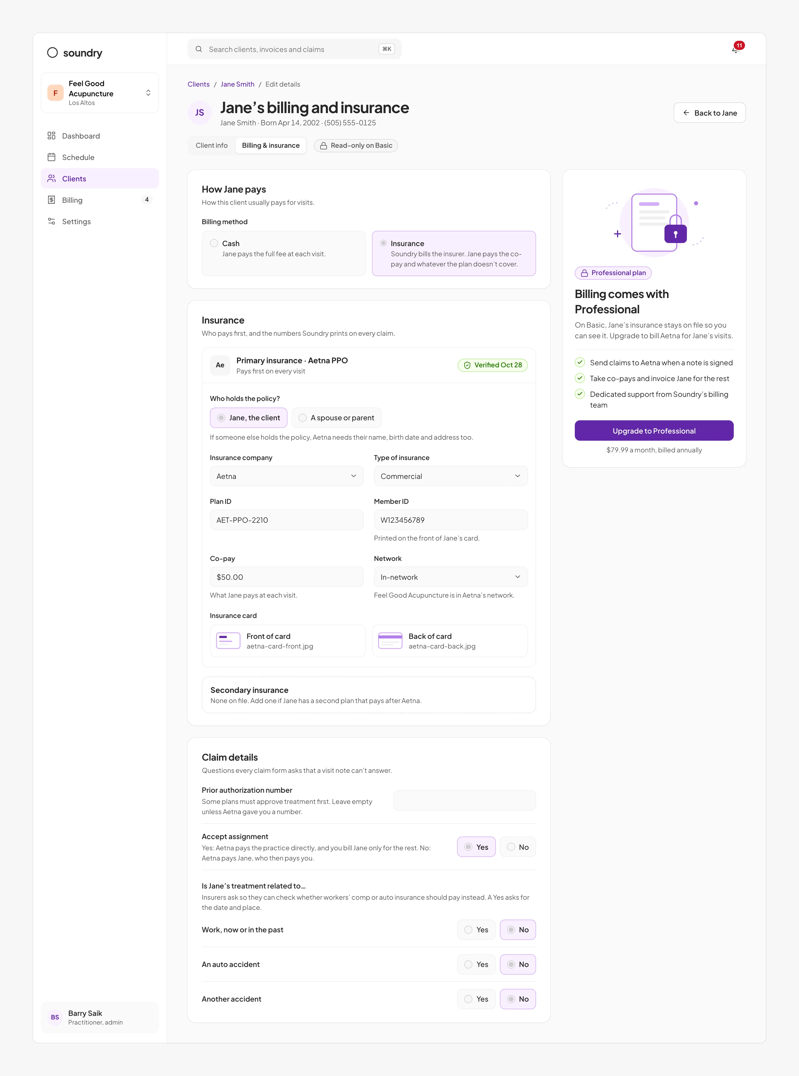
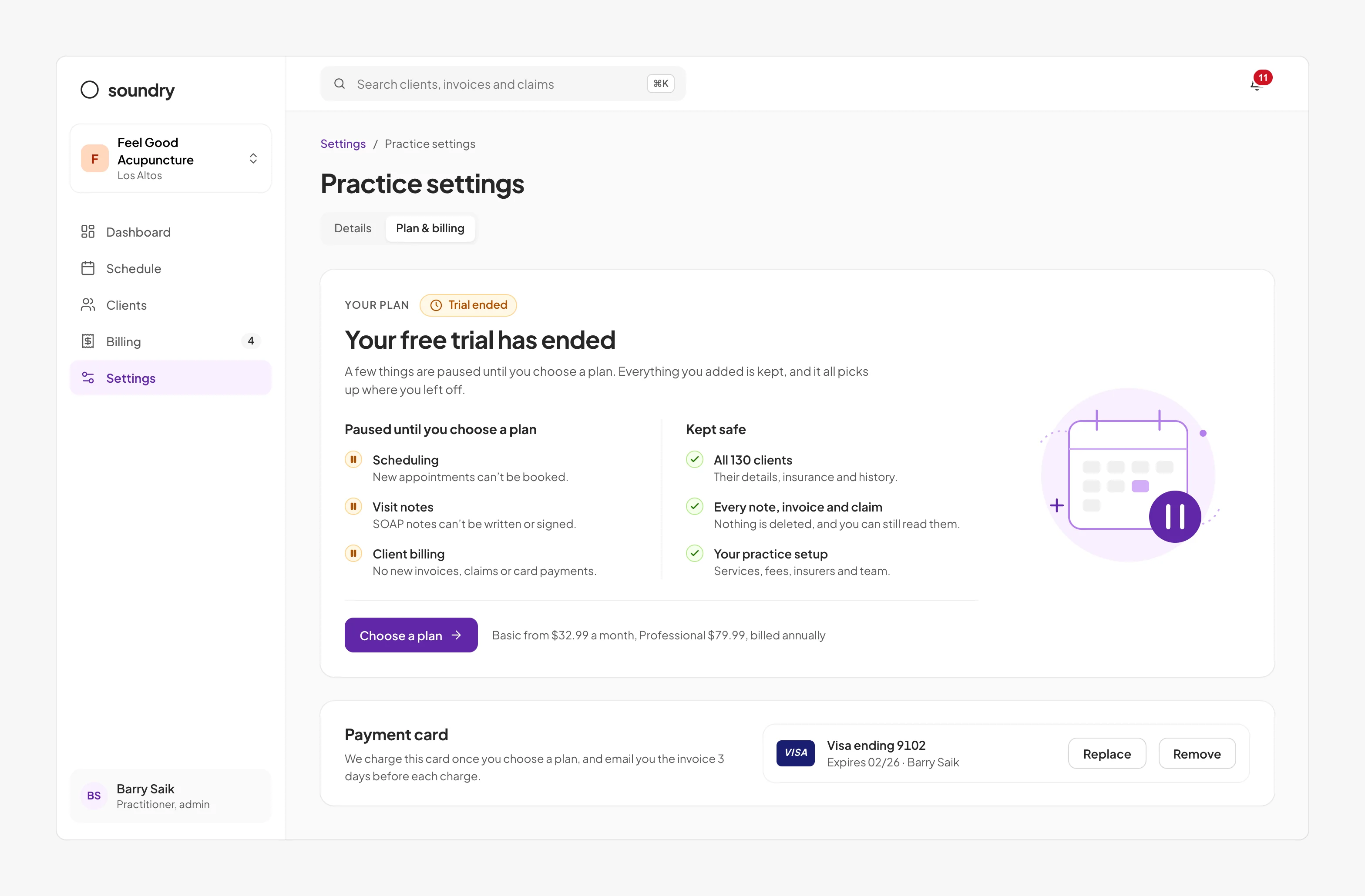
Billing, the primary reason practices chose Soundry, was included only in the higher-tier plan. Hiding it from Basic customers would have hidden the reason to upgrade, and survey responses suggested many practices were unaware that Soundry could bill insurers at all. On the Basic plan, billing is therefore visible but read-only, with an upgrade prompt alongside it, so practices can see their patients’ insurance information and what billing would do with it. When a trial ends, practices see precisely what is paused and what is retained, rather than losing access to their patient records.
How I worked
I established a weekly session with the biller to review real claims against the latest designs, which made them a design partner rather than a reviewer. I involved the engineer before designs were final, so the data model and interface were defined together, using the claim mapping as the specification. Where we disagreed, as with the billing tab, I proposed testing over debate, which kept decisions fast and grounded in observed behaviour.
Results
The product launched and grew to more than 90 US providers, processing over $2M in insurance coverage. Comparing claim data from the billing workspace for the three months before and after the new visit note:
Denial rate reduced from 22% to 8%
Driven by complete claims from the visit note and insurance verified before the first appointment.
Claim preparation time reduced from 20 minutes to 5
With the diagnosis, services and insurance already captured, claim preparation became a review rather than an investigation.
Time to insurer payment reduced from 41 days to 26
Driven by fewer resubmissions, and by denials resolved on the claim within days rather than weeks.
Trial activation doubled
The share of trial practices submitting a claim during their trial rose from 30% to 60% after the setup guide launched.
Key learnings
Integrate unwelcome tasks into existing workflows
The largest improvement came from embedding claim fields in the clinical note, not from a better billing screen. When users avoid a task, I now look first for where it can sit within work they already do.
Start research with the people who absorb a product’s gaps
The biller was not a customer, yet weekly sessions with them revealed more about what was broken than any practitioner interview. I now seek out whoever compensates for a product’s shortcomings, and begin research there.
Resolve disagreements with evidence
The billing tab disagreement was settled by one round of prototype testing rather than debate. In a disagreement, my role is to find the fastest route to observing real behaviour, not to win the argument.