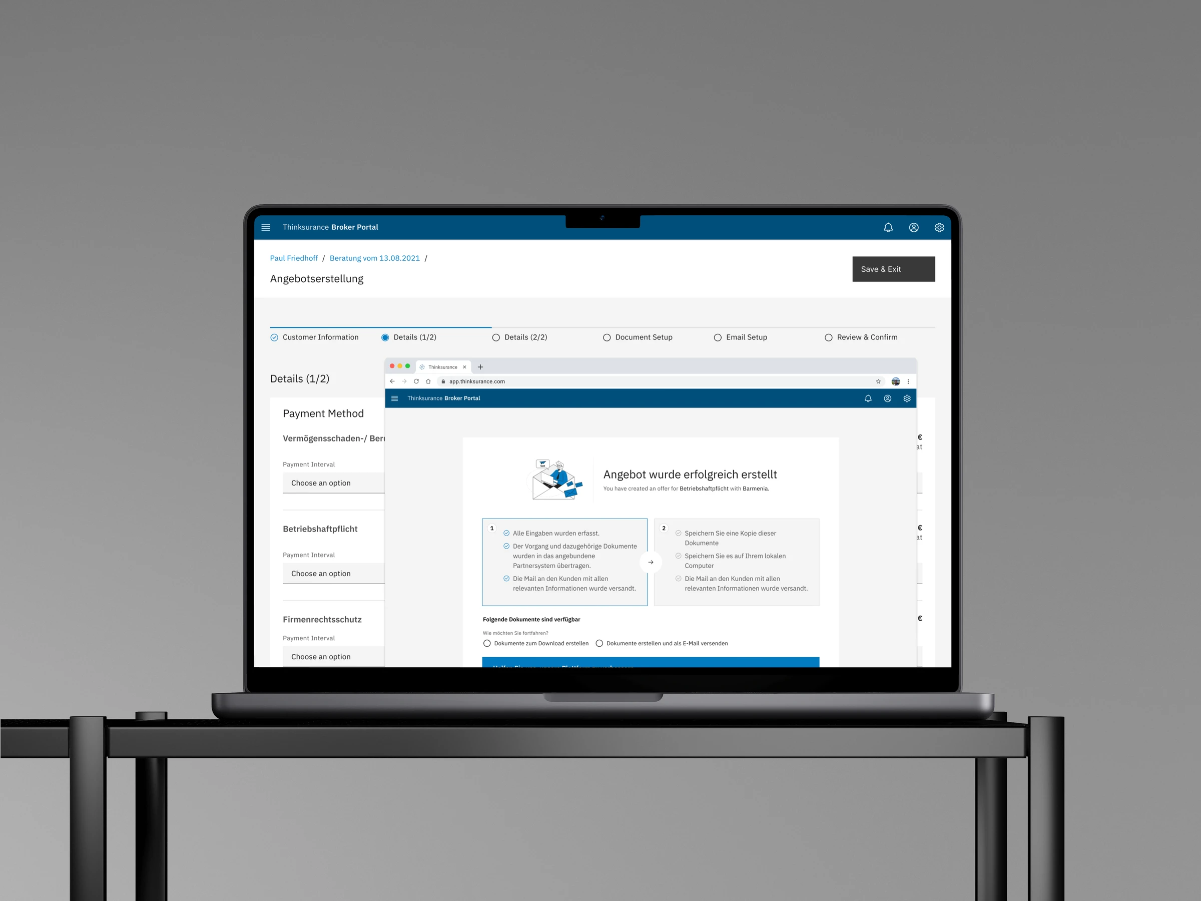
Booking Process Redesign
Redesigning how 45,000+ insurance brokers in Germany advise their clients and book commercial cover.
THINKSURANCE · INSURTECH- Timeline
- 4 months, August to November 2021
- My role
- Lead Designer
- Team
- Product Owner, Scrum Master, UX Researcher and 4 developers
- Market
- Germany
- Website
- Visit Thinksurance
Project summary
Thinksurance is a platform for commercial insurance in Germany. More than 45,000 insurance brokers use it to compare policies from many insurers, prepare offers and book cover for their business clients, supporting over €5.6M in annual revenue. Its core journey, from choosing products to booking a policy, had grown into a set of long forms and inconsistent screens that brokers struggled to complete.
As Lead Designer, working with a Product Owner, a UX Researcher and four developers over four months, I redesigned that journey around a single observation: brokers use Thinksurance to advise someone else. In the 12 weeks after launch, questionnaire completion rose by 15.9 percentage points and cover-note conversion by 16.9 points.
- Choose tariffs The broker picks a tariff for each product the client needs. A client often needs several products, so the tariffs travel into booking together.
- Confirm what to book One summary lists everything being booked. A wrong tariff is caught before any form is filled in.
- Choose a path Proposal or cover note is decided first. A non-binding offer and a binding order carry different stakes, so they need different forms.
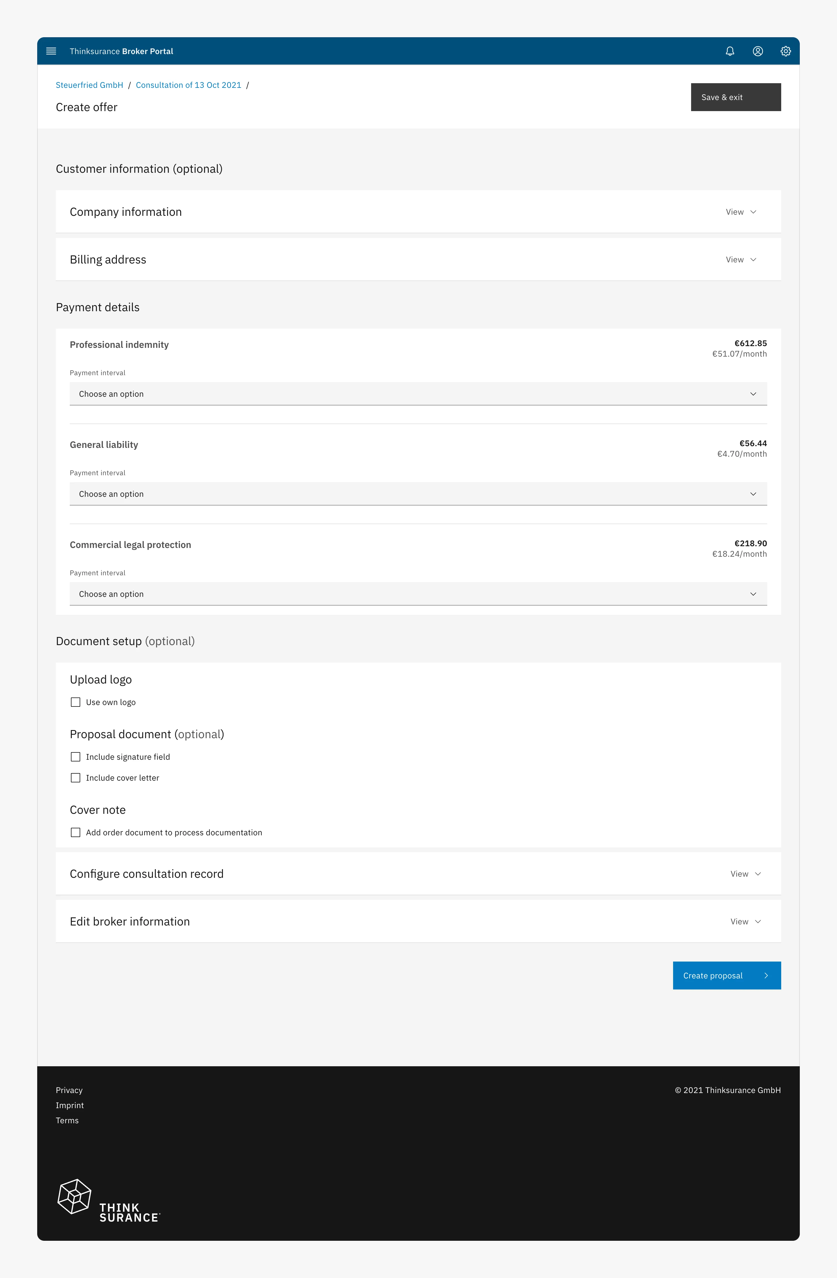
- Proposal: one page The proposal fits on one page, with everything optional collapsed. Brokers want a proposal quickly.
- Cover note: guided steps The binding path is split into steps, with progress shown and related fields grouped. Long forms were being abandoned.
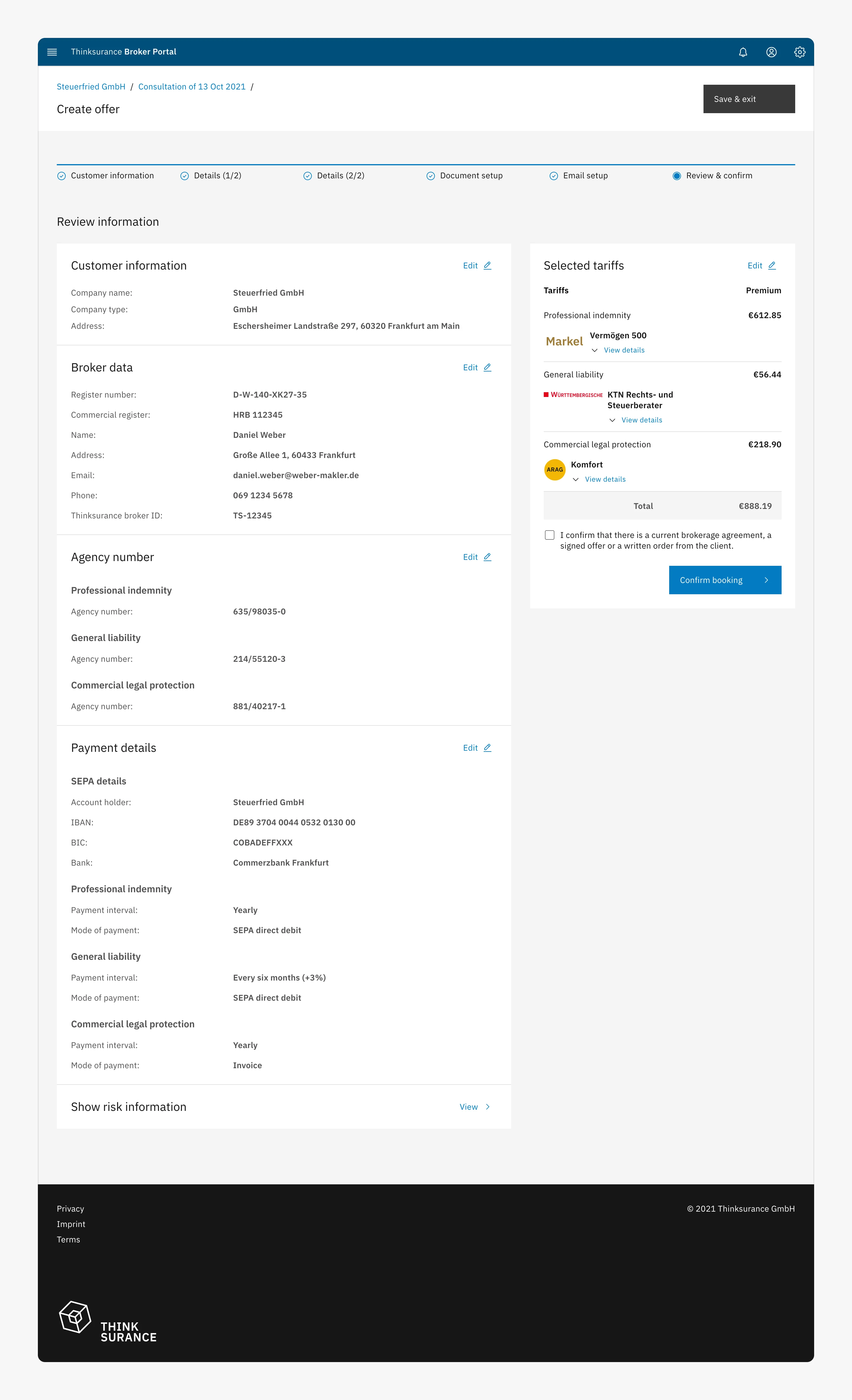
- Review before booking Every detail is reviewed, and can be edited, before the broker confirms. A cover note commits the client to a policy.
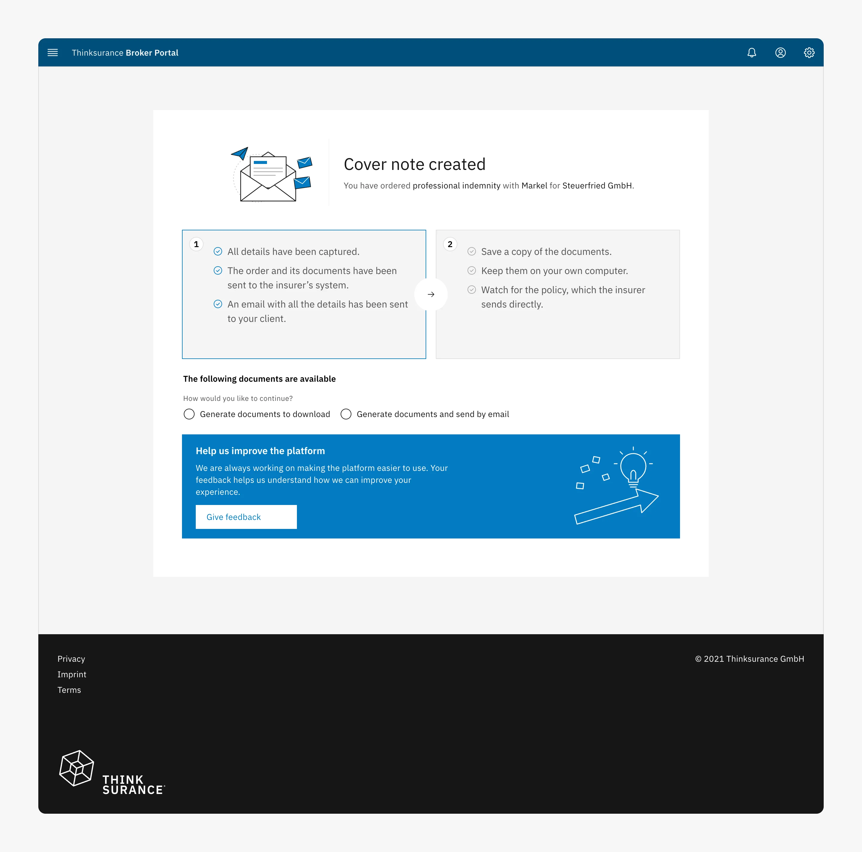
- Done, and what’s next The broker sees what has happened and what to do next. A feedback request replaces a Return home button that led nowhere useful.
The problem: a journey built for data entry, not for advising clients
A broker is an intermediary who finds insurance for business clients. On Thinksurance, a consultation has four stages. The broker selects the lines of insurance the client needs, answers a risk questionnaire about the client’s business, compares the resulting tariffs (priced offers from individual insurers) and books one. Booking takes one of two forms: a proposal, a non-binding offer document for the client to review, or a cover note, the legally binding order of cover from the insurer.
Before the redesign, each stage worked against the broker. Products were scattered across a grid that was hard to compare. Questionnaires were long, unstructured forms with no sense of progress and no way to save. Results displayed prices inconsistently, and the print button brokers relied on was hard to find. Booking was a single long form that treated a non-binding proposal and a legally binding cover note identically, and brokers frequently abandoned it. Every incomplete consultation was lost gross written premium (GWP), the company’s revenue metric.
Research
With the UX Researcher and the Product Owner, I combined qualitative and quantitative methods: 12 interviews with brokers about how they advise clients and book cover, 8 moderated usability sessions on the existing journey, a survey answered by 146 brokers, and product analytics in Heap. From the interviews we drew three broker types, and checked each decision against them.
The relationship-driven broker
Highly experienced in commercial insurance and still works largely on paper. Values an objective comparison to show clients, and questionnaires that raise the quality of advice.
The efficiency-driven broker
Works almost entirely paperless and wants autonomy and speed. Adopts a new process when it saves time and improves service to clients.
The generalist broker
Spends most of the day talking to clients, with moderate commercial-insurance expertise. Relies on the platform to cut documentation through automation.
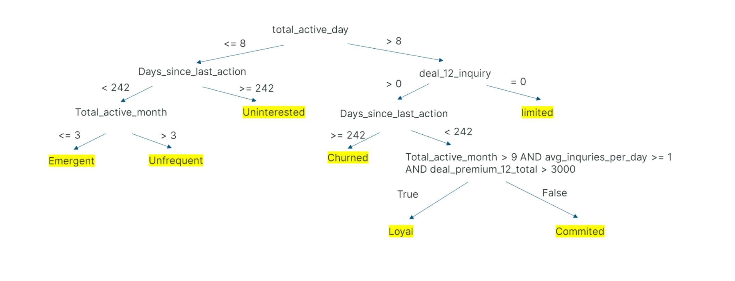
The Heap data gave us a segmentation of brokers by activity, and it told us where to start. The largest at-risk group ran consultations but rarely completed a booking (the limited segment below). Their sessions ended in the questionnaire and the booking form, so those two stages led the redesign, ahead of the visual refresh of pages that already worked.
Key findings
Brokers use the platform to advise a client, not only to buy insurance
Brokers described printing the results page to walk clients through their options, and asked for a way to send the questionnaire to clients to review. The platform had to support a conversation with a third party.
Brokers lost their place in long questionnaires
Usability tests showed brokers could not tell which questions remained, particularly when a consultation covered several products, and had no way to save and return later.
Results were hard to compare and present
Calculator prices and tender offers (custom offers requested from insurers when no standard tariff fits) were displayed differently, filters were unclear, and the print button was hard to find.
One booking form served two different intentions
A proposal and a cover note carry different stakes, but shared one long, undifferentiated form with no indication of progress. Brokers frequently abandoned it.
These findings shaped four design principles: design for the conversation with the client; show brokers where they are; separate what is binding from what is not; and make the primary action unmistakable on every screen.
Strategy: design for the consultation
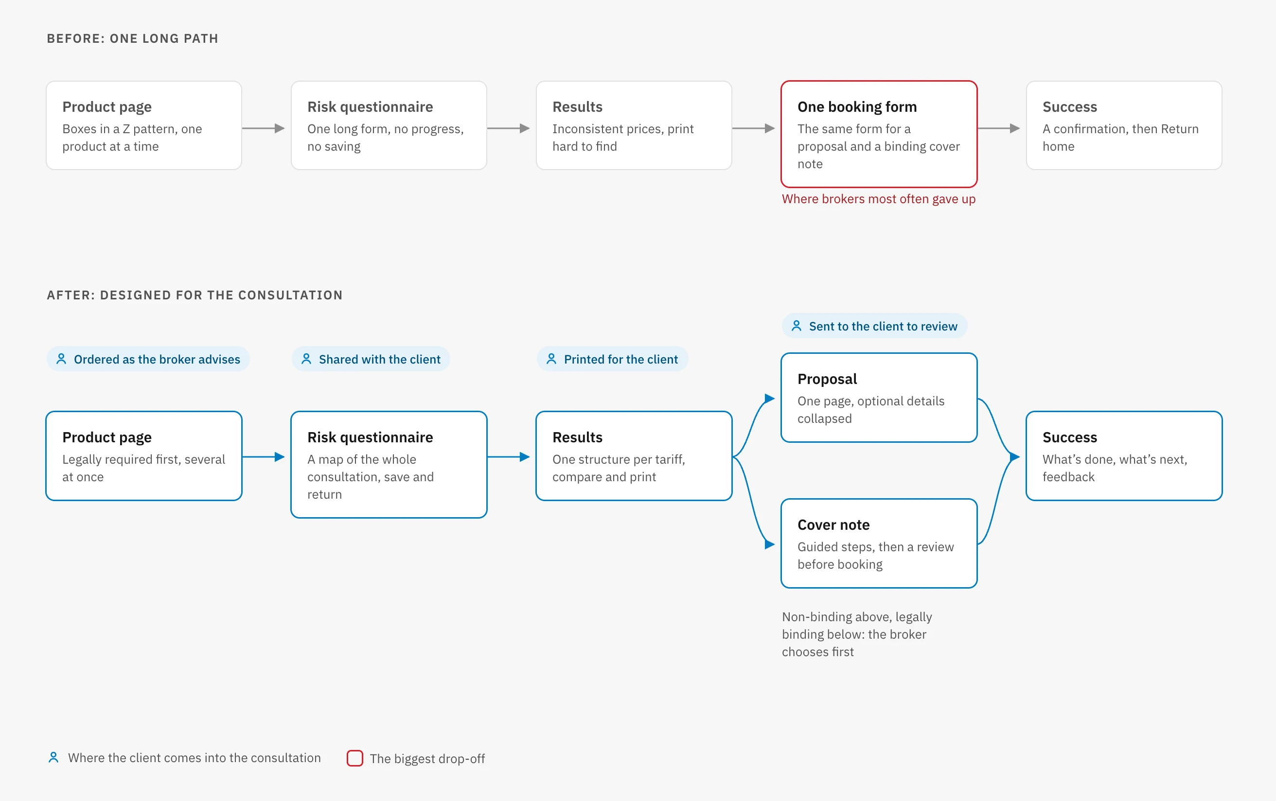
Rather than treat each screen as a separate form, I mapped the journey as a single consultation with the client, from product selection to booking. I agreed these flows with engineering before designing screens, so the developers could scope the APIs against them.
The map produced the change that defined the redesign: after choosing a tariff, the broker decides whether to prepare a quick, non-binding proposal or a guided, legally binding cover note, and each path is designed for its purpose. The decisions below follow the consultation in order.
Decision 1: A product page brokers can scan and select from
The product page is where a consultation begins: the broker chooses which lines of insurance to quote for the client. The original page arranged products in boxes across a Z pattern, which made categories hard to compare, used rating badges that brokers ignored, and allowed only one product to be selected at a time.
I restructured it as a single list ordered by importance: products legally required for the client’s business first, then strongly recommended, recommended and optional ones. Each product sits on one horizontal card with the same facts in the same place (tariffs available, sum insured and premium range), so brokers can scan a single column. Checkboxes let brokers select several products at once, and details expand in place. The order also follows the conversation: a broker starts by telling the client which cover the law requires, then what is recommended, so the page presents products in the order they are discussed.
- The original page Products sat in boxes across a Z pattern, and only one could be selected. Brokers overlooked the rating badges, so products had to become comparable at a glance.
- A vertical grid Boxes in a Z pattern made products hard to compare. Categories lined up vertically, in order of importance. The heatmap still showed attention scattered, and the badges drifted from their products.
- Horizontal cards Attention was scattered, and badges sat apart from their products. One card per product with its facts in a row, legally required products first. Opened details were still too heavy.
- The shipped page Details were too heavy, and only one product could be selected. Badges set apart from the facts, lighter details, and checkboxes to select several products at once.
Why the badge moved
Internal testing of the horizontal cards showed the badge’s position drew attention away from the product information. The badge matters, because it tells brokers which cover the client must have, but it should not compete with the facts brokers compare. I set it apart from the card’s content, applying the isolation effect so it remains noticeable without dominating.

Decision 2: A questionnaire that shows brokers where they are
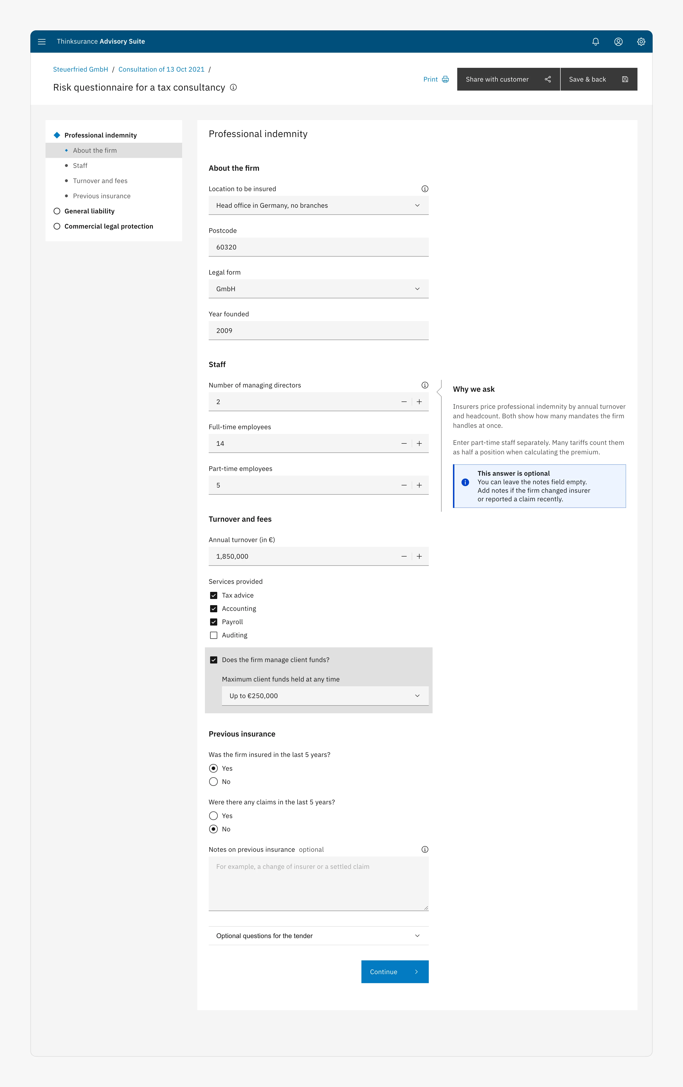
The risk questionnaire describes the client’s business so the calculator can price tariffs. A consultation can cover several products, each with its own questions. Usability tests showed brokers losing their place, and the original form offered no way to save progress.
I introduced a side menu that maps the whole questionnaire: each product, its question categories and the broker’s position. It scales to consultations with several products and nested groups, such as a fleet of vehicles. Context for specialist questions moved into a help panel beside the form, so it no longer interrupts it, and generalist brokers get the explanation they need without leaving the question. Consultations often pause while the client gathers figures such as turnover or headcount, so Save & back lets brokers leave and return, and Share with customer sends the questionnaire to the client to review. The questionnaire can now move between broker and client, as the consultation does.
- The original form A long form in an outdated style, with no sign of progress and no way to save. Brokers fill it in with the client, so they needed to see where they were and to pause.
- A cleaner form The form showed no progress and couldn’t be saved. Updated inputs and a column for context, but still no overview of progress, and only a partial way to share with the client.
- The shipped questionnaire No overview of progress, and sharing with the client was partial. A side menu maps products, categories and position, with help beside the questions and actions to save or share.
Decision 3: Results brokers can compare and present
On the results page, brokers compare tariffs and decide what to offer. Research showed a consistent behaviour: brokers printed the page to show their client, but the print button was hard to find. Calculator results and tender offers were displayed inconsistently, and the page’s actions had no hierarchy.
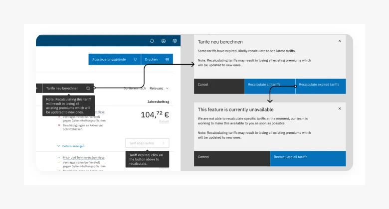
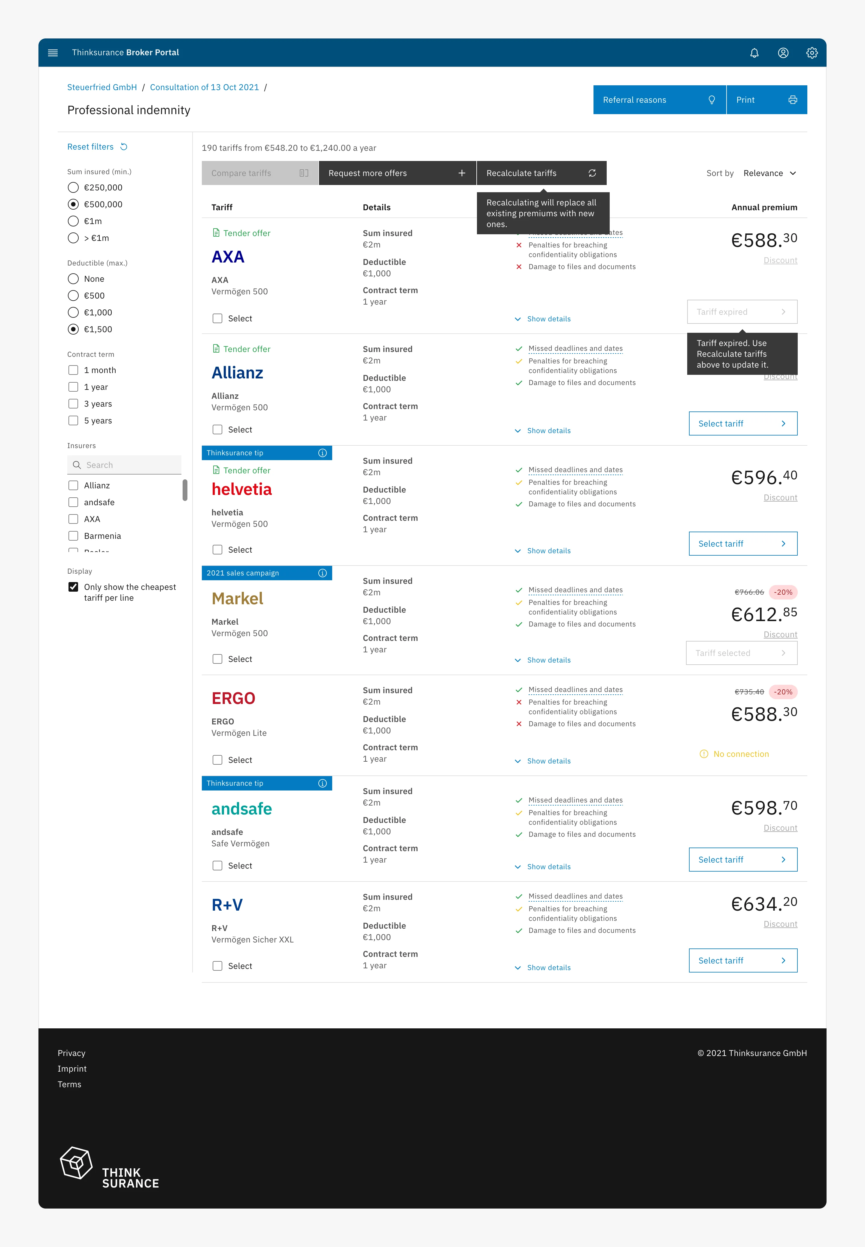
I gave every tariff the same structure (insurer, key terms, highlights and annual premium), showed the number of tariffs and the price range at the top, and made Print a primary action, which relationship-driven brokers rely on to talk clients through a printed comparison. The two most used features, comparing tariffs and requesting more offers, sit together in the toolbar. Expired tariffs are flagged, with a tooltip explaining how to update them.
- The original page Clashing colours, unclear filters and no hierarchy between actions. The print button was hard to find, and nothing showed which action came first.
- A consistent layout No shared structure between tariffs, and print was hidden. Every tariff in the same structure, a visible print button and the price range. Expired tariffs still couldn’t be seen.
- The shipped page Expired tariffs were invisible and couldn’t be recalculated. Expired tariffs are flagged, with a recalculate action and a tooltip explaining what it does.
Alternative considered: recalculating only expired tariffs
Engineering could build recalculation of all tariffs quickly; recalculating only expired ones would take significantly longer. Rather than commit that time to an assumption, I designed a fake-door test: brokers could choose either option, and the selective one showed a message that it was not yet available. Over three weeks, about 7 in 10 brokers who opened the dialog chose to recalculate only expired tariffs. We shipped recalculation of all tariffs with a clear warning that existing premiums would be replaced, and scheduled selective recalculation for the next increment.
Decision 4: Two booking paths, not one form
The original booking step was one long form for both proposals and cover notes, with inconsistent actions and no indication of how much remained. Brokers frequently abandoned it. Yet the two outcomes carry different stakes: a proposal is a document for the client to consider, while a cover note commits the client to a policy.
After the broker confirms the tariffs to book, a dialog asks which they want to prepare. The proposal path is a single page, because brokers, and efficiency-driven ones especially, told us they want to generate a proposal as quickly as possible; optional information sits in collapsed sections. The cover-note path is a sequence of steps, with progress shown throughout, fields grouped into sections and a final review page. I chose that review pattern from e-commerce because a legally binding order should be checked before it is sent.
- The original form One long form for both proposals and cover notes, with no progress shown. A cover note is legally binding, so brokers needed to see where they were and what they were committing to.
- Steps, without grouping One long form, with no progress and inconsistent actions. Steps showed progress, but fields floated on the page, and testing showed they were harder to scan.
- The shipped cover note Fields floated without grouping and were hard to scan. Fields grouped into sections on a consistent grid, and a review page before the binding order is sent.
Closing the loop
The original success page only confirmed that the booking had been submitted. The redesigned page separates what has been completed (details captured, documents sent to the insurer, the client emailed) from what the broker should do next. Brokers choose whether to download the documents or send them by email, and a request for feedback replaces the Return home button, giving the team a direct measure of satisfaction.
How I worked
The team worked in Scrum, almost entirely remotely, across time zones in Europe and Asia. I agreed user flows with engineering before designing screens, so developers could scope the APIs against them, and took prototypes to sign-off sessions with the Product Owner to validate business requirements early.
The original plan was to ship the new visual style across the existing journey first and restructure booking in a later release. Using the Heap funnel, I showed the Product Owner that most consultations were lost in the questionnaire and booking steps, not on the pages being restyled, and we agreed to restructure booking in the first release instead.
Where the right answer was uncertain, as with tariff recalculation, I proposed a test rather than a debate. Scope changed repeatedly as timelines and resourcing shifted, so I defined each release as the smallest usable version, not a reduced version of the full design.
Results
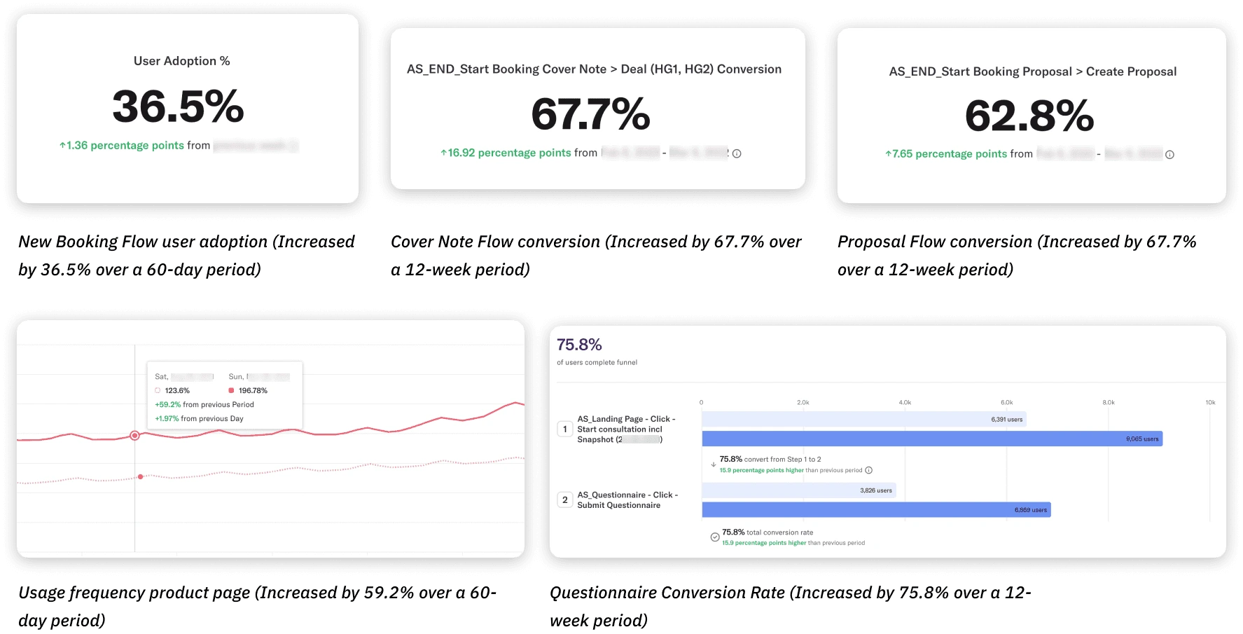
Measured over the 12 weeks after launch against the preceding period, using Heap, Hotjar and Mouseflow:
Questionnaire completion rose to 75.8%, up 15.9 points
6,869 questionnaires were submitted, against 3,826 in the previous period, following the side menu, saving and clearer structure.
Cover-note conversion rose to 67.7%, up 16.9 points
Driven by the separate, stepped cover-note path and the review page.
Proposal conversion rose to 62.8%, up 7.7 points
Driven by the single-page proposal path.
36.5% of brokers adopted the new booking flow within 60 days
Product-page usage rose by 59.2% over the same period.
Key learnings
Design for the person who never logs in
The broker’s client rarely touched the platform, yet shaped every decision, from printing results to sharing questionnaires. I now ask who else a user is serving when they use a product.
Test assumptions with the smallest possible experiment
The fake-door test settled the recalculation question in weeks without building the feature. I now look for the cheapest way to observe real behaviour before committing engineering time.
Define the smallest usable release
Shifting scope taught me to distinguish a true minimum viable product from a reduced design that is not usable, and to defend that line early.